
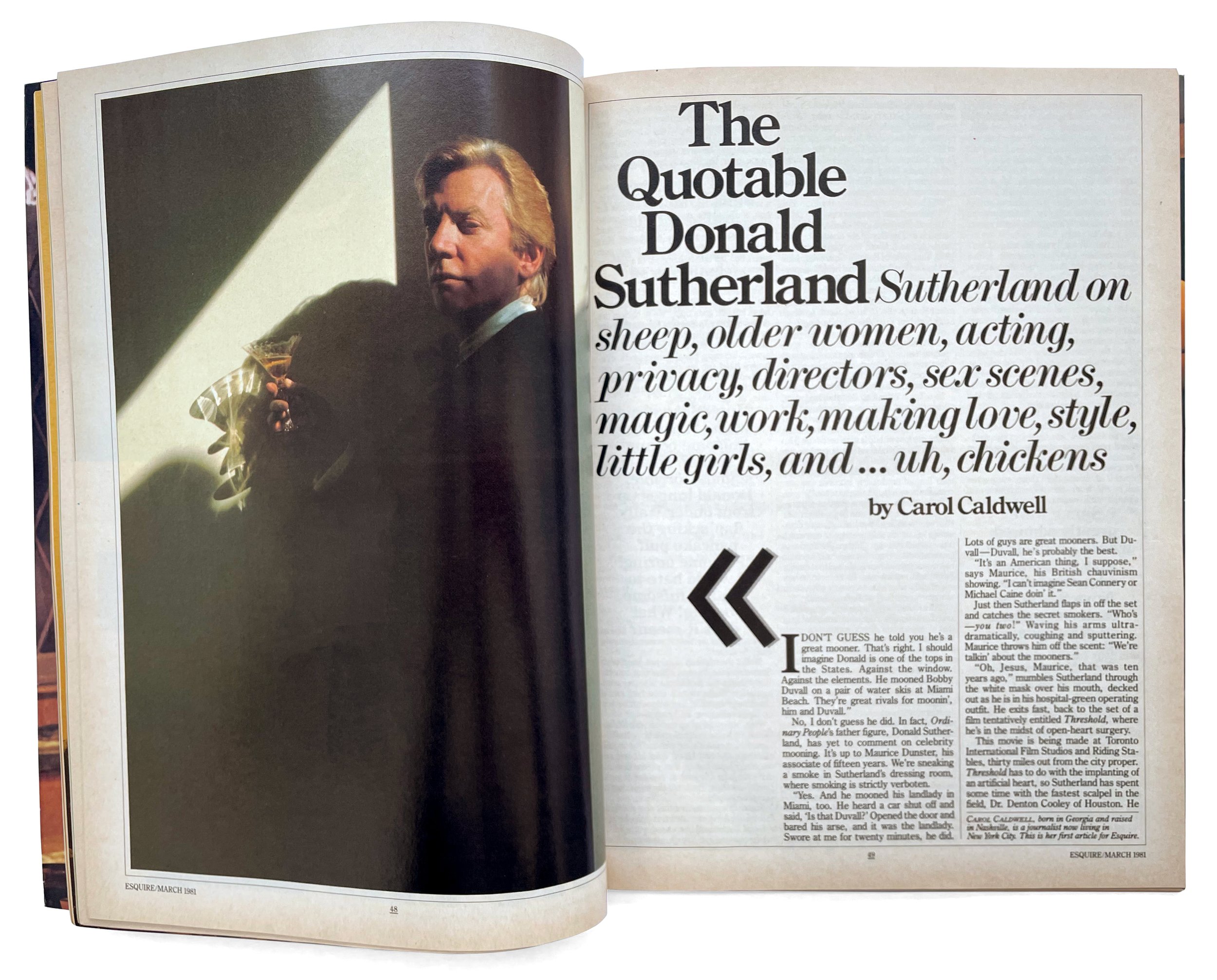
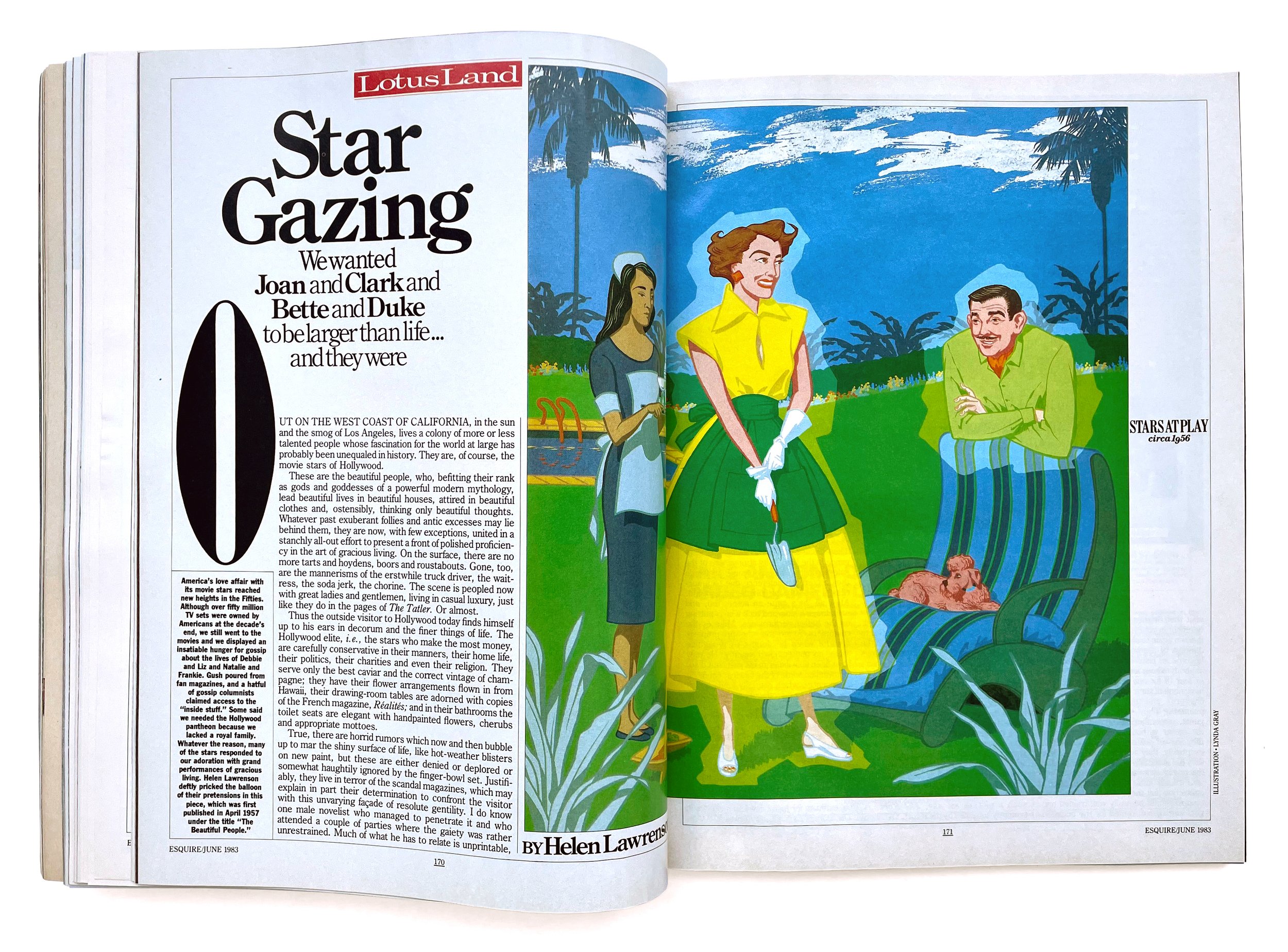
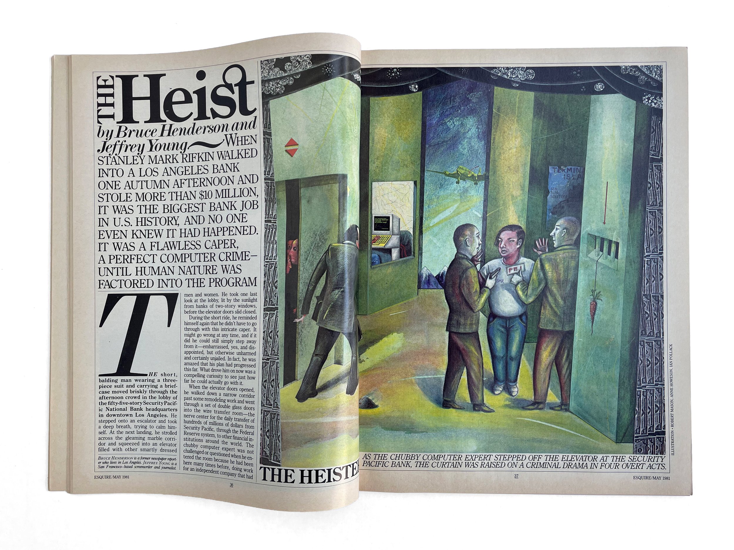
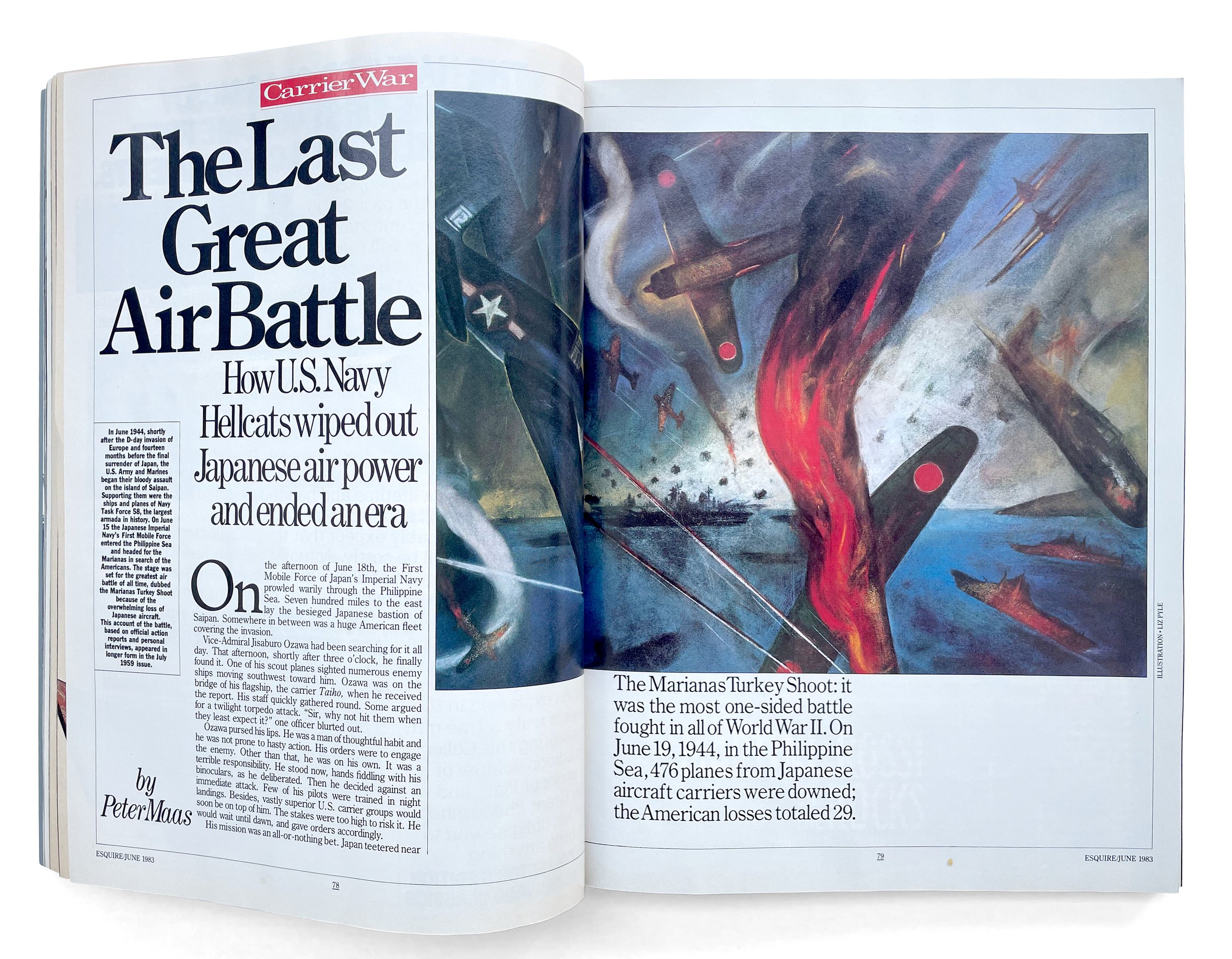
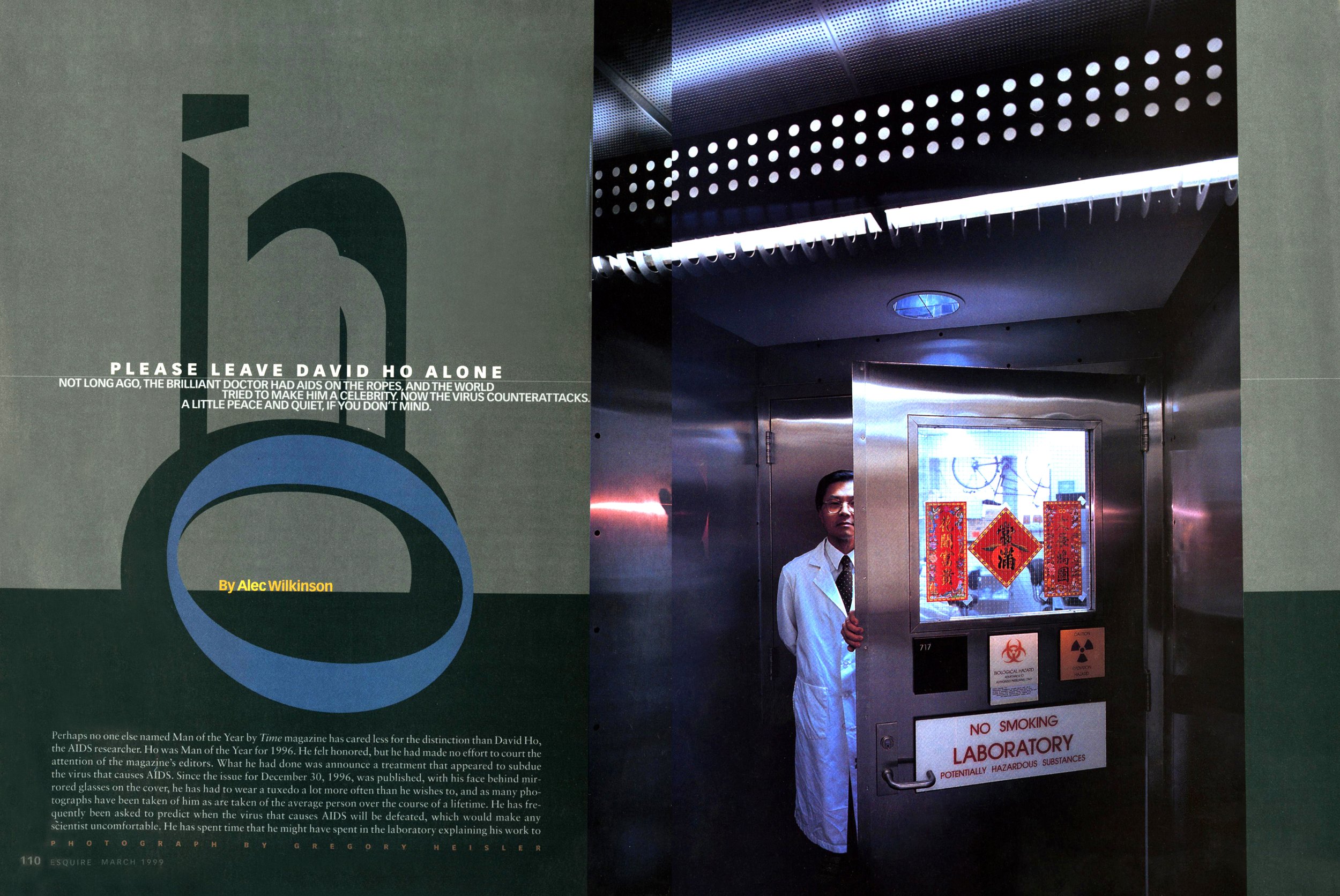
An Englishman in New York
A conversation with designer Robert Priest (8x8, Esquire [twice!], GQ, House & Garden, more).
—
If you can count yourself among the lucky ones who’ve met Robert Priest in person, any chance you remember what you were wearing?
Well, fear not: He does. According to his business partner, the designer Grace Lee, Priest possesses a near-photographic memory of how people present themselves. And those first impressions last a lifetime.
To hear him talk, though, it’s not at all about being judgy. Priest is just naturally consumed with all things visual. He has been since childhood. (He gets it from his mother). To him, design is everything.
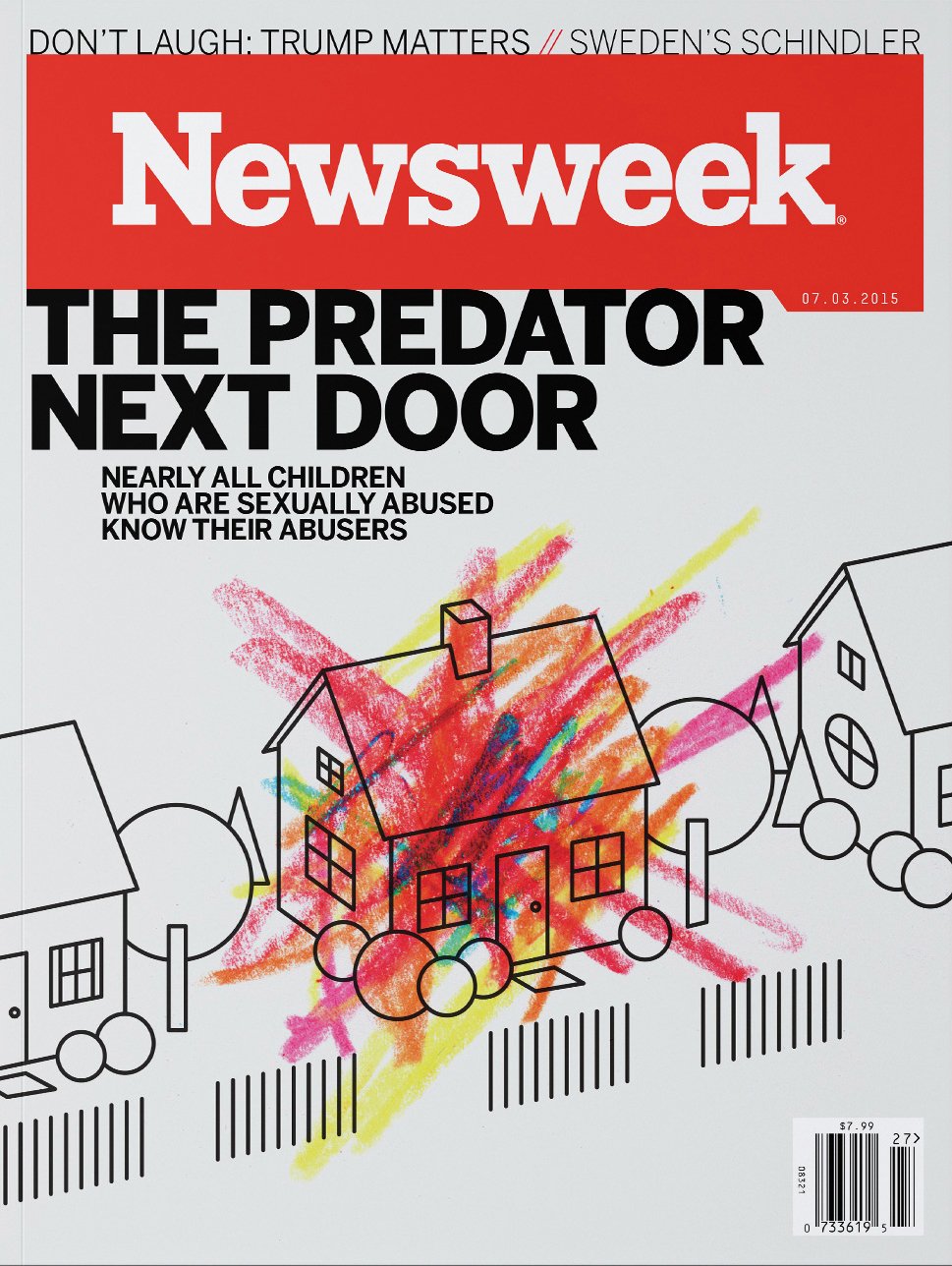
Priest has dedicated his 50-plus-year career to the relentless pursuit of taste, style, and fashion. And it shows. He has led design teams at all of the big magazines: GQ, House & Garden, InStyle, Newsweek, and Esquire (Twice!)
But there’s another side to Robert Priest. He’s a huge sports fan. And designing magazines is his sport. Indeed, like a head coach, he’s hired to win. And the trophies in this case are readership, advertising, circulation, and buzz—and when that’s all taken care of, the design awards start to pile up—they certainly have for him.
We talked to Priest about his early days in London, when he—and The Beatles and the Rolling Stones—were just getting started, about why soccer is the real football, and the rise and fall of one of the biggest magazine launches in history, Condé Nast Portfolio.
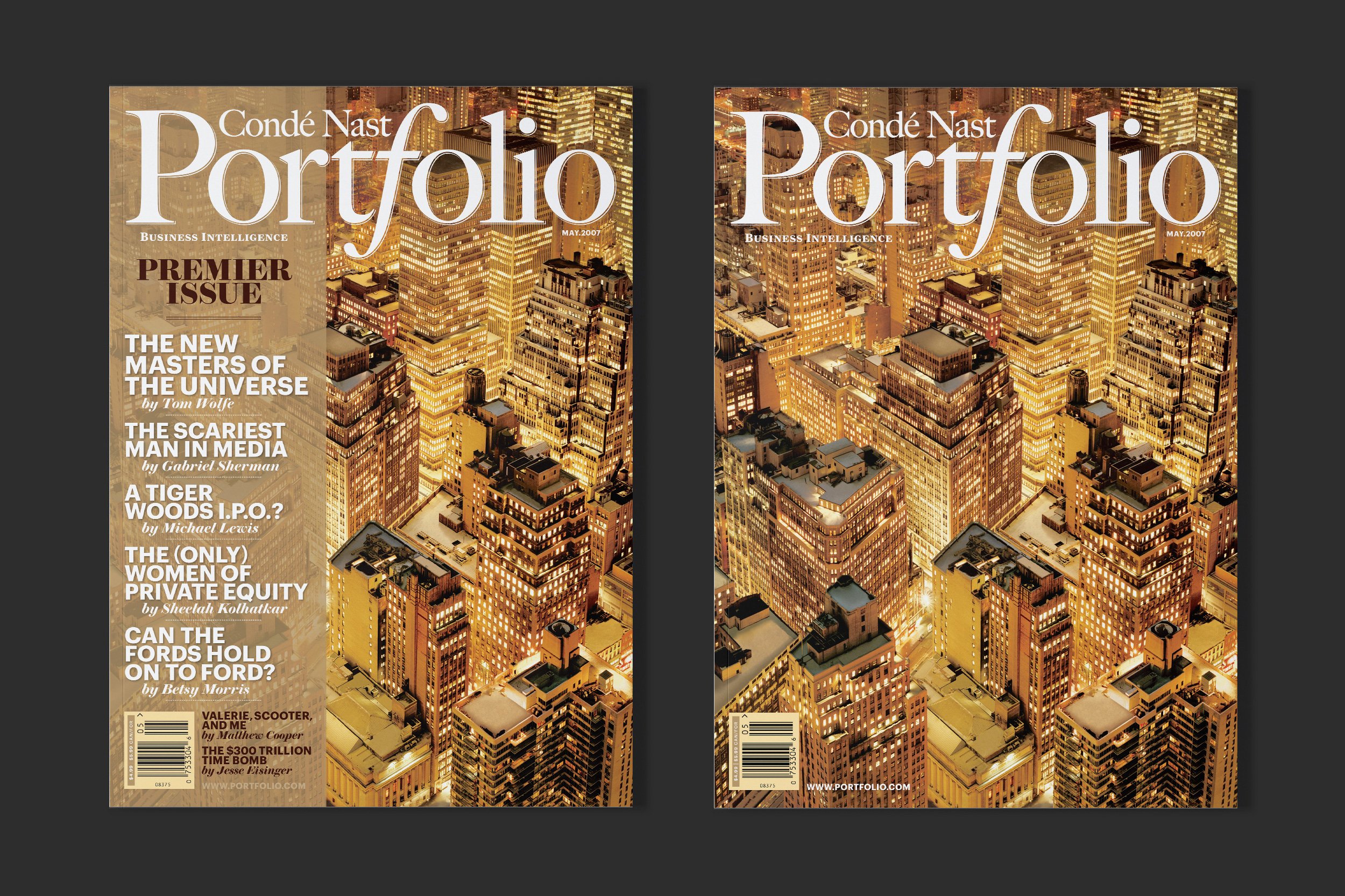
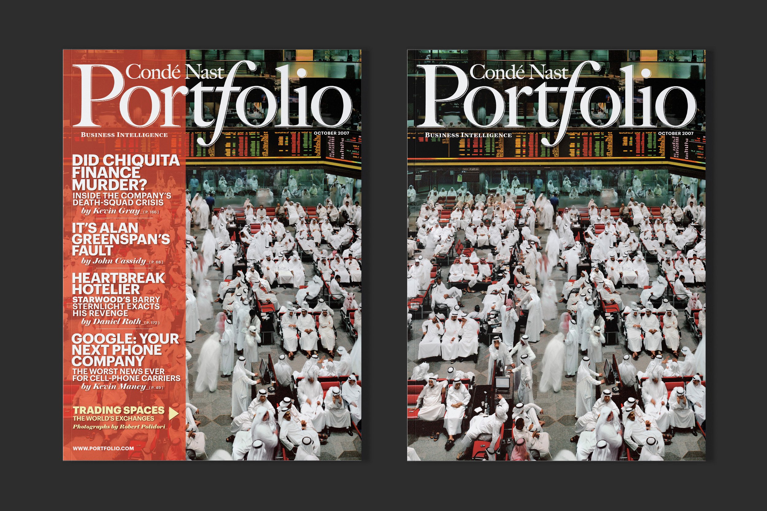
Condé Nast Portfolio was one of the biggest launches in magazine history.
Patrick Mitchell: We’re going to start at the beginning, Robert. If you could just tell us a little bit about growing up in the UK in Middlesex. What was it like there, growing up in the fifties and sixties?
Robert Priest: Well, yes. Yes, west London. I was quite near Heathrow. It was a very quiet, sleepy town to be quite frank. My father worked for the public sector of the British government in the Ministry of Defense, and he came from a working class family in Shepherd’s Bush in London. And he was in World War II in Italy and Libya.
-
ENGLAND (1968-1977)
Spectator Publications (1968–69)
Wine and Food (1969–1970)
BOAC Welcome Aboard (1970–71)
Flair (1972)
Robert Priest Design (1972–75)
British Clinical Journal (1973–4)
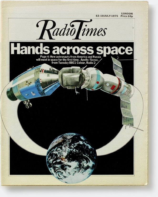
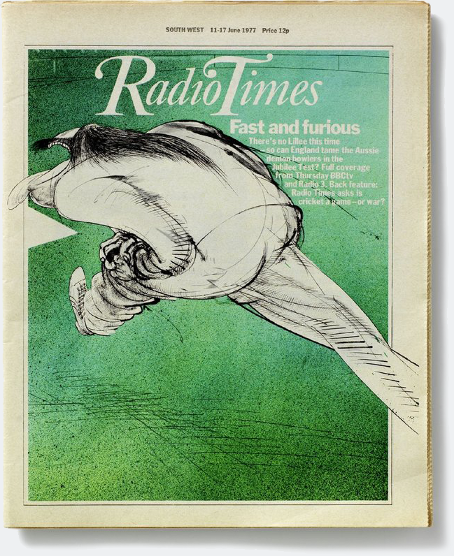
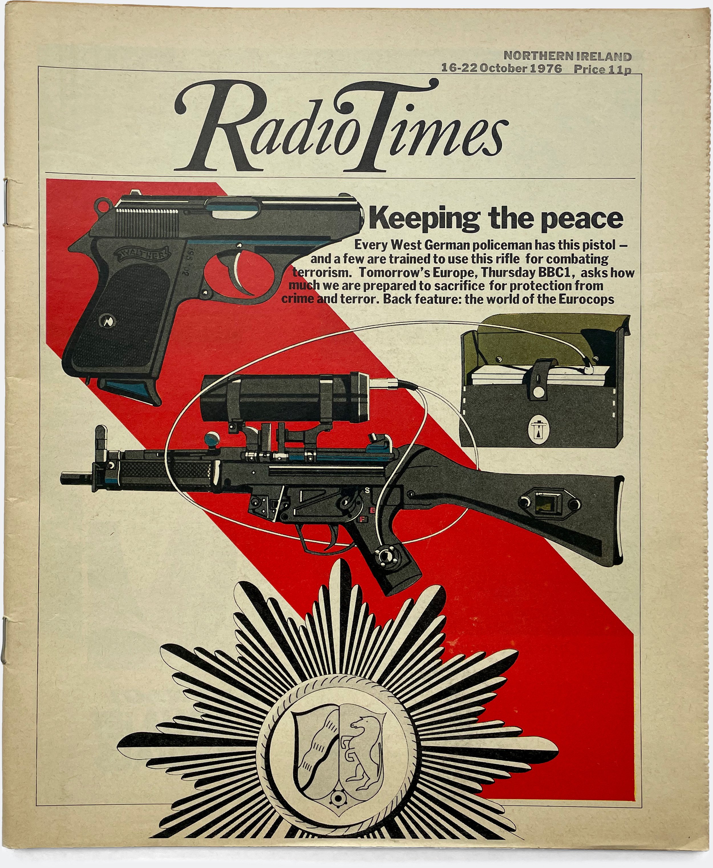
Radio Times Specials / BBC (1975)
Radio Times / BBC (1975–77)
D&AD Annual (1977)—
CANADA (1977-1979)Weekend Magazine (1977-79)
—
USA (1979– )Esquire, v1 (1979–1983)
American Illustration Annual (1982)
Newsweek (1983–85)
Us Magazine (1985–88)
GQ (1988–1995)
House & Garden (1995–97)
Esquire, v2 (1997–99)
Report on Business / Globe & Mail (1999)
Priest Media Inc. (1999–2006)
In Style Specials (1999–2002)
Avon Dreams (2003)
Liz Claiborne Life (2003)
Gala Magazine (2003)
Bloomberg Personal Finance / Redesign (2003)
O at Home (2004–05)
Hollywood Life / Redesign (2004)
More (2004–05)
SPD Annual 39 (2004)
SPD Annual 40 (2005)
Sky Magazine / Delta Airlines (2005–06)
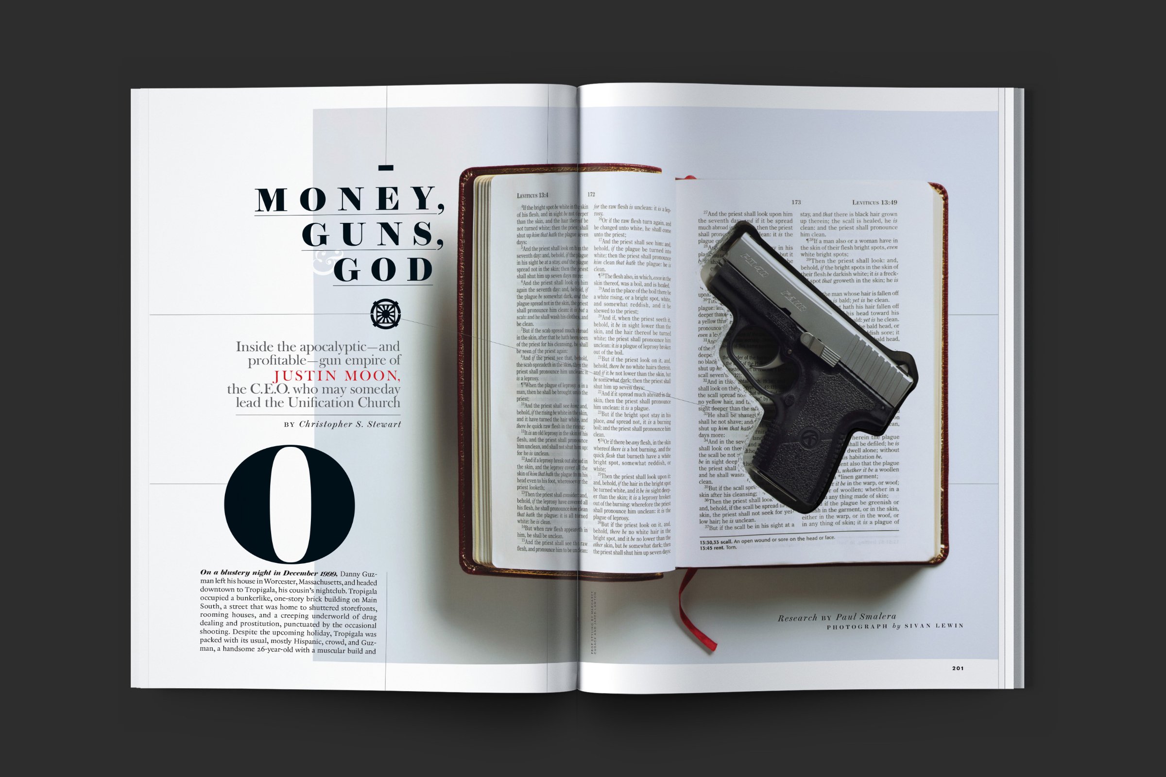
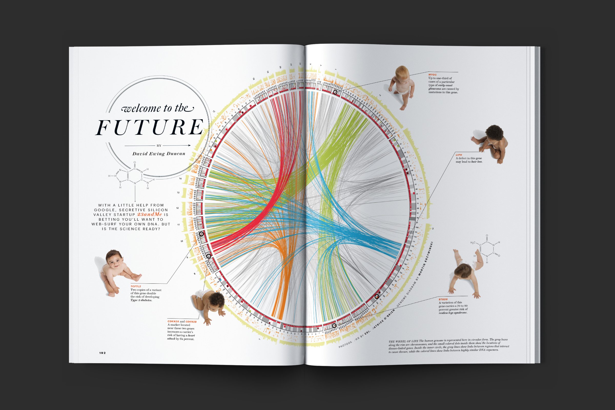
Condé Nast Portfolio (2005)
Priest + Grace LLC (2009–Present)O, The Oprah Magazine / 10TH Anniversary Special (2010)
O, The Oprah Magazine (2010–13)
Weight Watchers Magazine / Redesign (2011)
Forbes Life / Redesign (2012)
Media Jet (2012)
Web MD / Redesign (2012)
New York Observer /Redesign (2012)
Bloomberg Markets / Redesign (2013)
Howler (2012–2013)
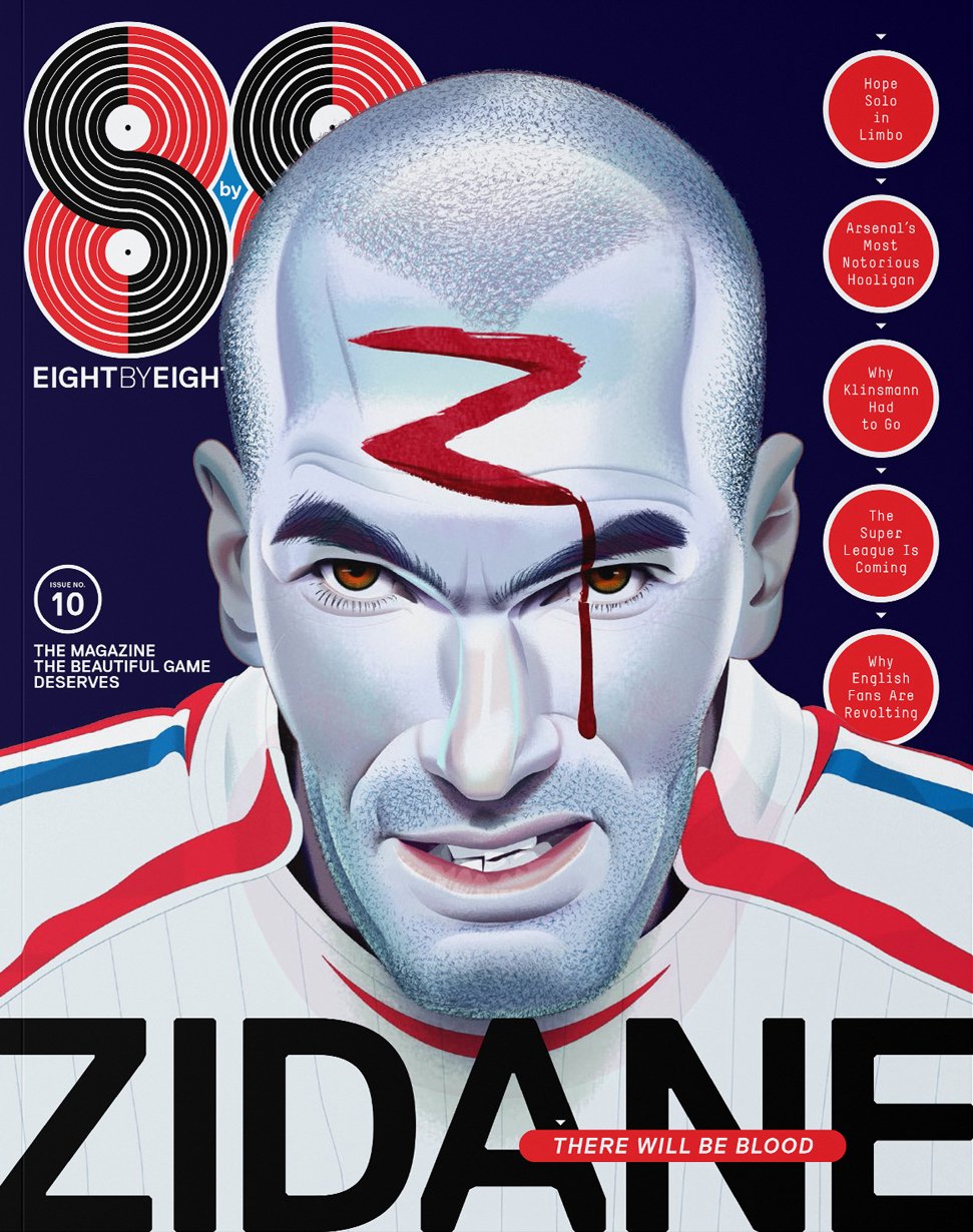
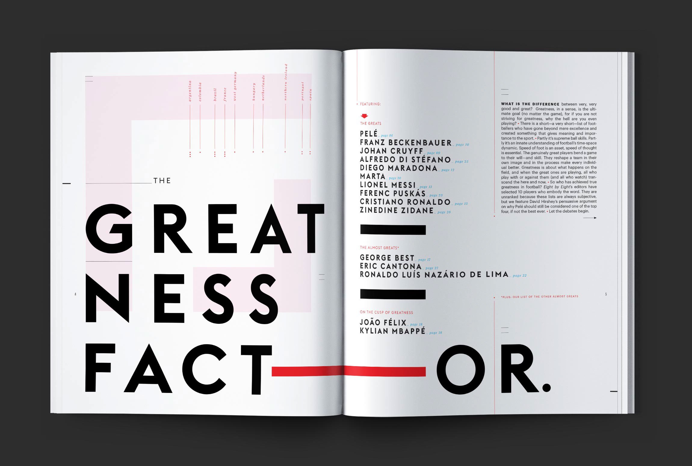
Eight by Eight (2013–Present)
Trending New York (2014)
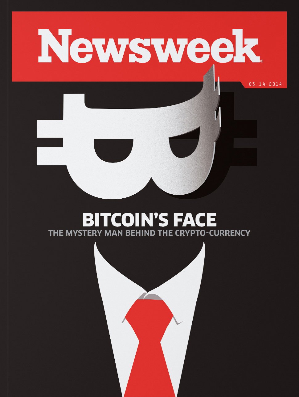
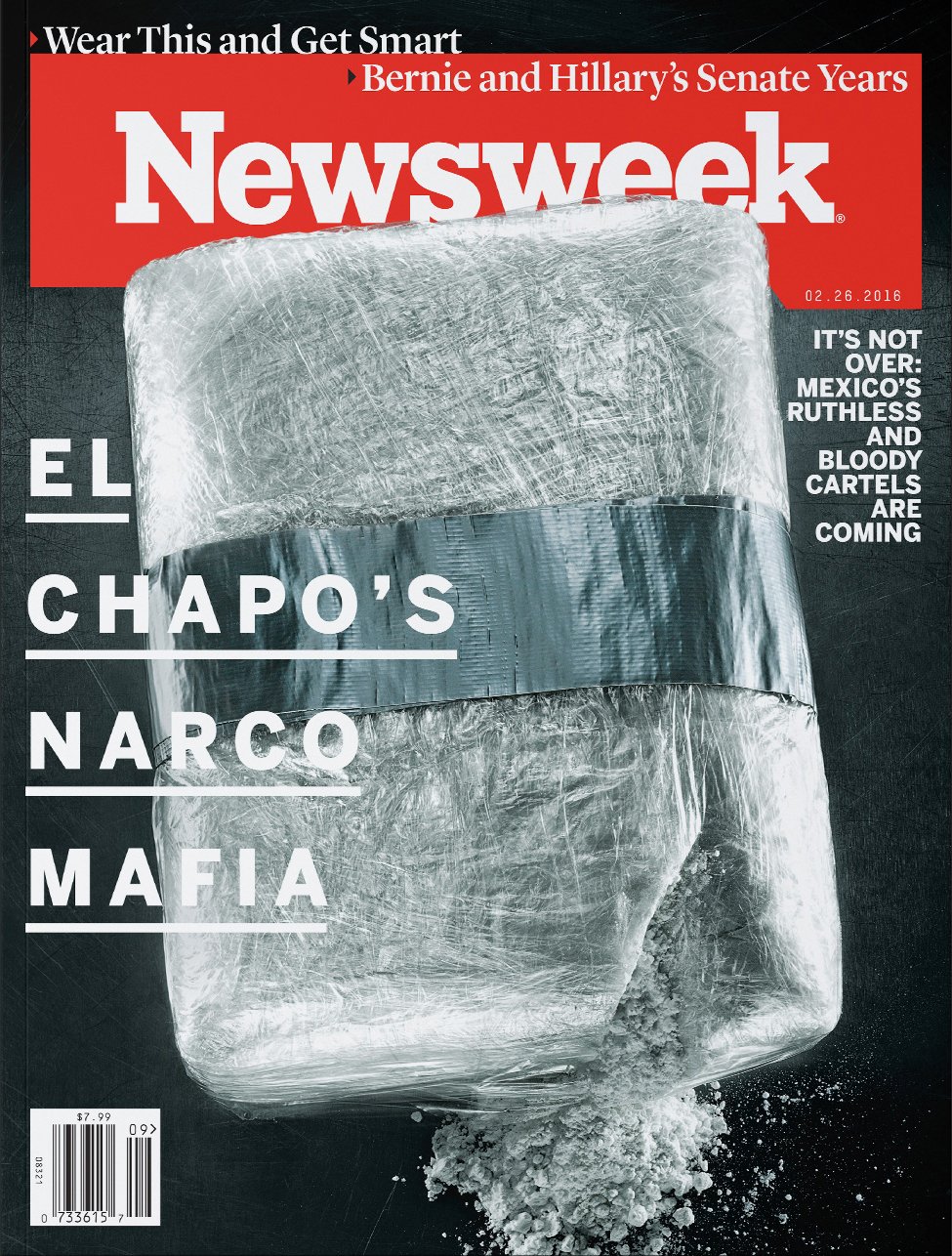
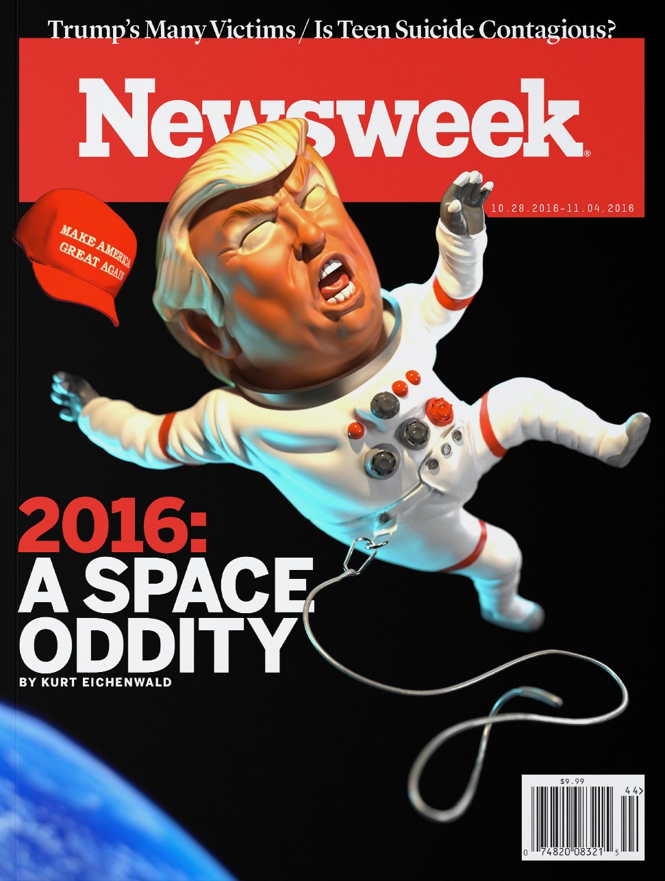
Newsweek, v2 (2014–17)
Opera News / Redesign (2015)
AARP Bulletin / Redesign (2016)
New Beauty / Redesign (2016–18)
Skin Cancer Foundation Journal (2017-Present)
NYCFC for the City (2018)
Smithsonian / Redesign (2018-2020)
Dubin Breast Center, Mount Sinai / Book (2018)
Elle Decor / Redesign (2018)
Air and Space Magazine, Smithsonian (2019)
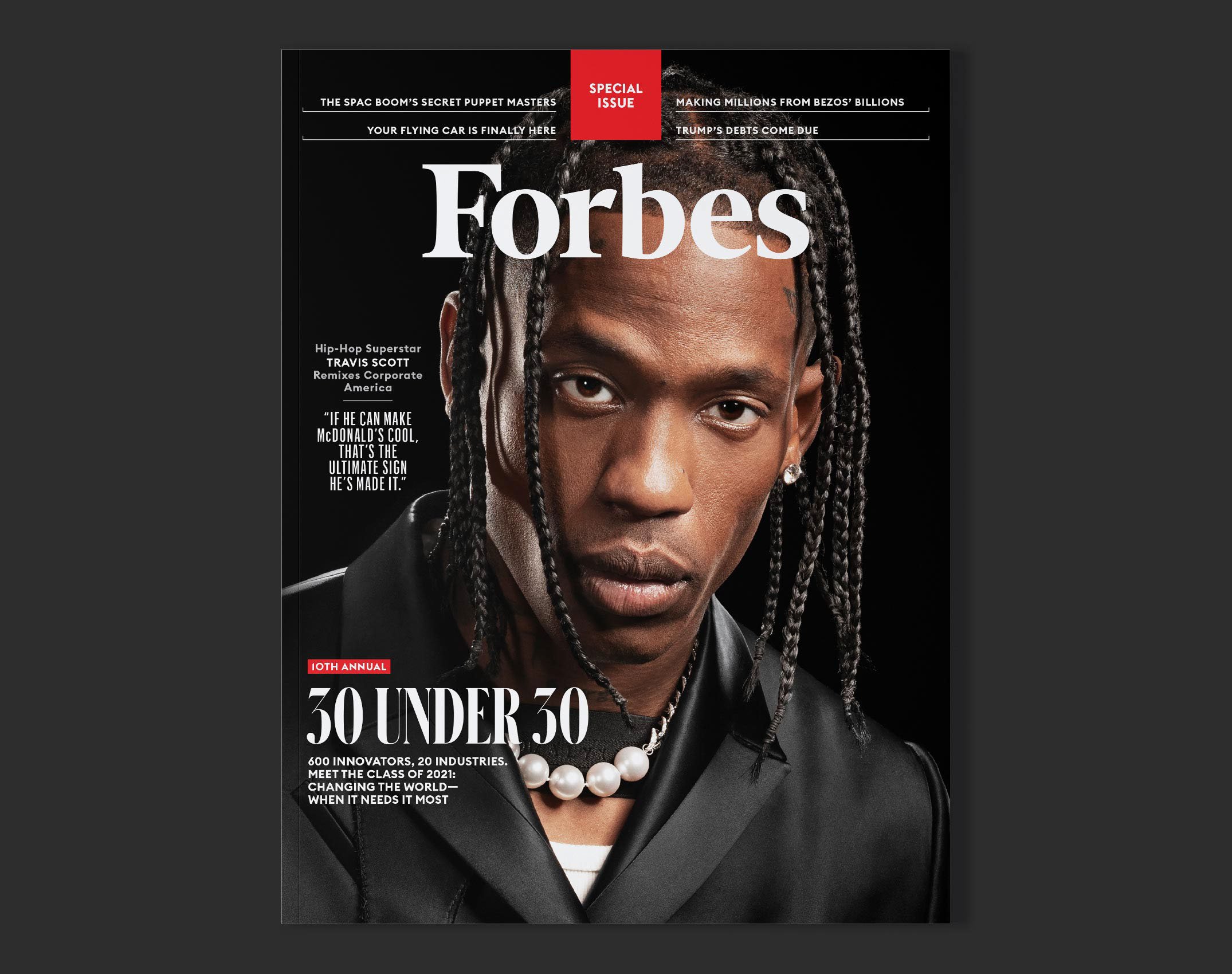
Forbes / Redesign (2019)
Forbes (2019-present)
Relentless, Mount Sinai / Book (2021)
NYCFC Commemorative Book (2022)
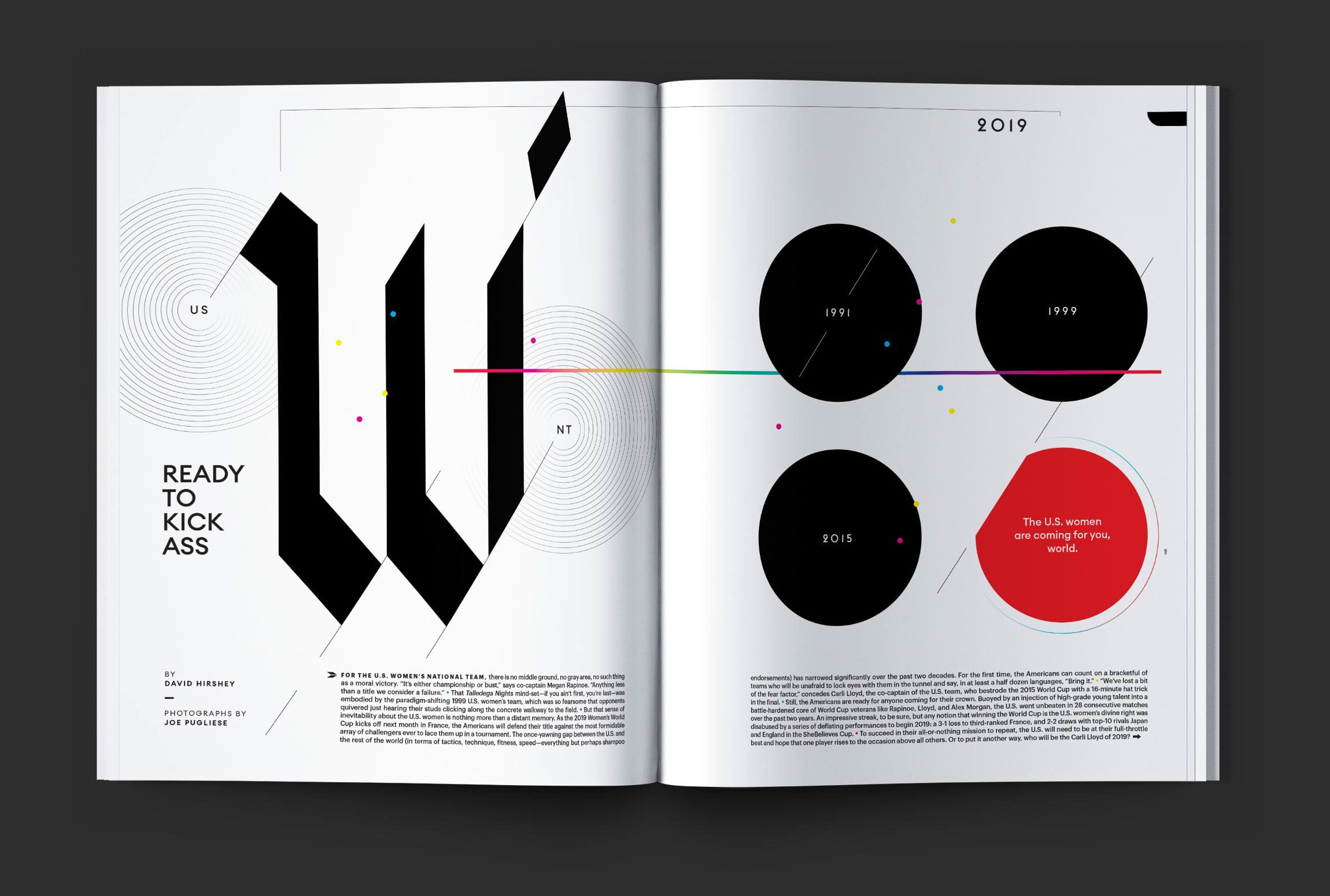
Pride of a Nation, USWNT / Book (2022)
Apple News Euros (2020–21)
Oprah Daily / Website (2022)
Apple News World Cup (2022)
Apple News Wome’s World Cup (2023)
According to my sister, who’s 10 years older than me, he had a pretty bad time. It was just a rough experience leaving a three-year-old behind. And I think that really affected the rest of his life. Mother was the artistic one. She was essentially a homemaker. She made things. Clothes, mostly. Literally all my clothes except for my grammar school uniform.
That lasted until I discovered Carnaby Street. It was a street off Regent Street in Central London that kind of celebrated the new kinds of clothes that the sixties were about to explode. So, then I went rogue on my mom and just went for that kind of clothing. I was about to go to art school at that point and it was really great for me.
Patrick Mitchell: You were making a statement.
Robert Priest: Yeah, I was making a statement.
Debra Bishop: Was there a eureka moment where you were like, “Oh, I have a special talent”? Or was that something that evolved?
Robert Priest: I felt two things. I felt that I was a leader, even though I was shy. And I felt that I had taste. My mother had taste and I felt that I had taste. And I have been looking for good taste all my life. Good taste in almost everything, but mostly the way people look. I’m absolutely fascinated by people’s faces.
I should have been a portrait painter in the 13th century because I just love faces. And the human figure, actually. So that clothes idea was more “decorating” that human figure. And in those days that’s exactly what it was.
And then I went to grammar school and I was a pretty decent student, but I did suffer from a little bit of anxiety, sometimes doing less well than I expected to. But I was extremely lucky to have a charismatic art teacher called Elvert Thomas. And he left the school a year before me and moved to a purely art school called Twickenham College of Art.
And he asked me to follow him. I’d done some paintings and drawings that he was impressed by. And he thought I had promise as an artist, or a commercial artist as they were known then. But I was staggered at the quality of painting and drawing at the school and quickly decided to study design.
And there was a television graphics designer and illustrator called Bernard Blatch, who joined the school and kind of revolutionized the design department while I was there. He had ideas sort of on the level of someone like Christoph Neiman now. Not quite as genial as Christoph is, but still really good.
And as a result of that, I’ve sort of always gravitated toward idea-based illustration rather than decoration. And there was a sort of exceptional student there called Colin Fulcher who went on to become Barney Bubbles. Do you know about Barney Bubbles?
He was an amazing designer in the sixties and created this underground newspaper called Oz, which was sort of a psychedelic-looking, really interestingly printed—and you’d never seen anything like that before. And it was very influential. It sort of changed everybody’s point of view about print, quite honestly.
And Barney also went on to design Elvis Costello’s albums: My Aim is True and This Year’s Model and Joe Jackson’s Look Sharp. Do you remember that with the pointed shoes on? That one was actually shot in my house by Brian Griffin. I’d moved to Toronto sometime later, but he’d rented my house and shot the album cover there.
Patrick Mitchell: Going back to childhood, what was the first magazine that you actually remember—where it actually got you thinking about what a magazine was and if it interested you at all?
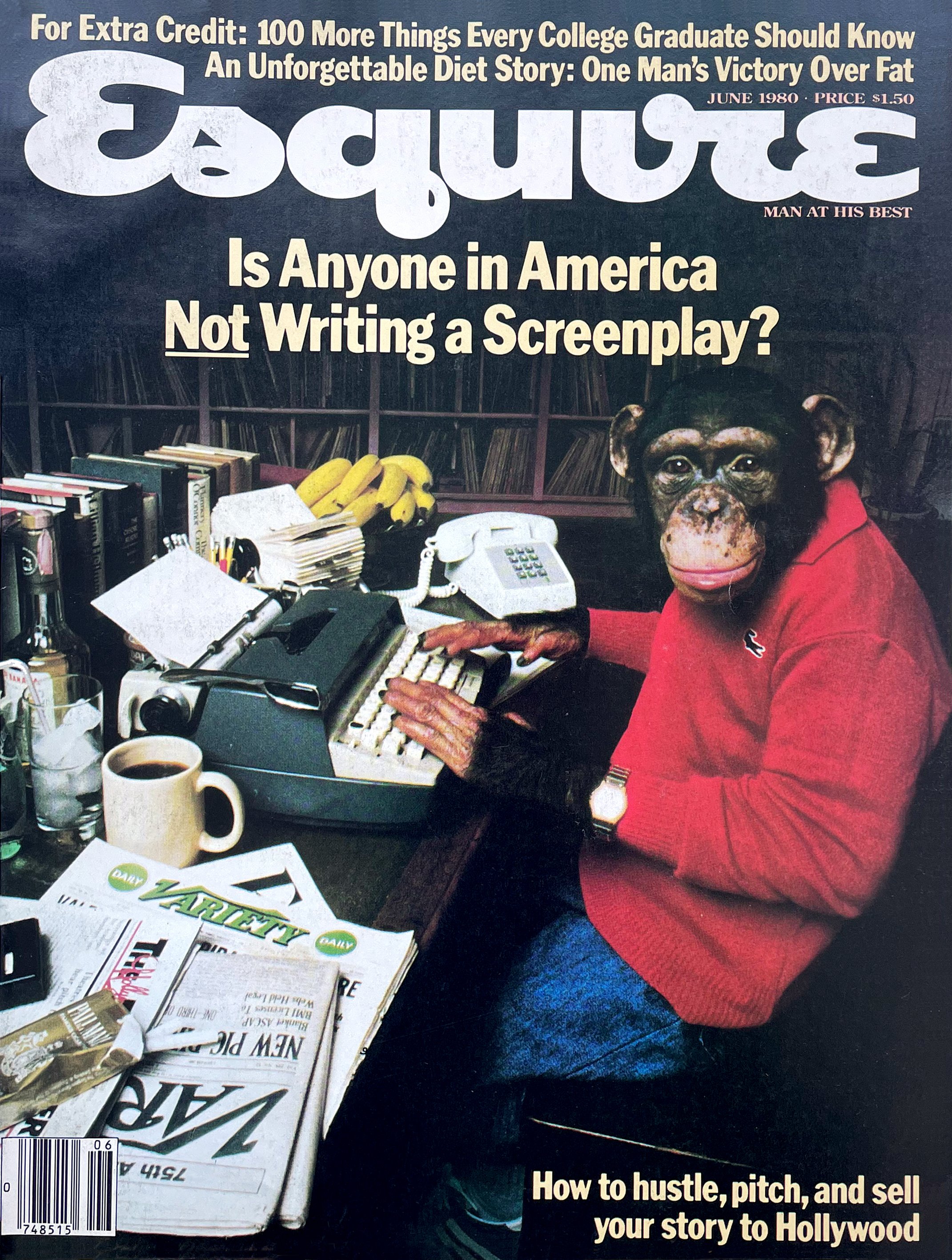
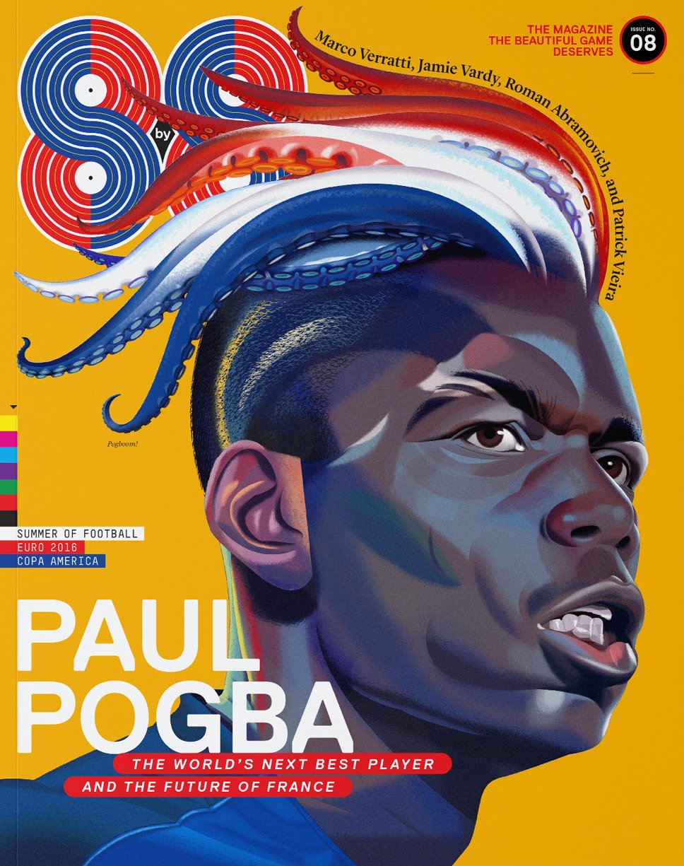
Robert Priest: Well, as a young child I used to be influenced by football magazines. And that was a bit of the influence that made me start Eight by Eight. But after that I would say the great Esquire period. I mean, I wasn’t a real kid, I was a teen. But those George Lois covers were working in England as much as they worked here—and so staggeringly different from everything else you saw. I don’t think the inside was designed that well, as a piece of design. Some of the art was good. But yeah, that was a massive influence on me.
Patrick Mitchell: I mean, God, you were essentially in the room where it happened. You were a contemporary of the Beatles and the Rolling Stones and everything that was going on in London in the sixties.
Robert Priest: I was.
Patrick Mitchell: How did that affect your life?
Robert Priest: Well, there was a certain part of my life—Twickenham was very near Richmond. And in 1963 I used to go to see the Rolling Stones—before they’d made a record.
Every week on Sunday night, from June to September of that year. So 20 or 30 times. They hadn’t written any songs yet. They were just playing Bo Diddley and Muddy Waters music. And you’re standing right next to them because the stage is about a foot high and there’s 300 people in a very low-ceilinged room.
I was a Stones person and not a Beatles person. Although I love The Beatles. The Stones just had this … energy.
Patrick Mitchell: You’re either one or the other.
Robert Priest: You are, really. Yeah.
Debra Bishop: You’ve always been an immaculate dresser, Robert and obviously interested in style. So did you look like the Rolling Stones? I would love to see a picture.
Robert Priest: I did. I do. I did.
Patrick Mitchell: How much velvet did you wear?
Robert Priest: No! What it was—everybody, literally everybody, wore a gray sweater (Mick Jagger, too), a pink gingham shirt and pinstripe flared pants. And those shoes that the Beatles used to wear from Anello & Davide, with kind of a high heel on them. Yeah, I was exactly that person, embarrassingly enough.
Debra Bishop: And did you have a Beatle cut for your hair?
Robert Priest: No. My mom made me a Beatles jacket once. Those ones that button up to the top. But my hair never did that. It all sort of went—it’s gone now—but it all used to swing to one side. It didn’t look like Paul McCartney at all. Very disappointing.
Debra Bishop: But that’s always good when it has a little movement.
Patrick Mitchell: But, Carnaby Street, is that what established your fascination with fashion and style?
Robert Priest: Yes, very much so. And there was the King’s Road in Chelsea that started a number of shops selling things—handmade or just very different from anything anybody was wearing. I had friends, Pat Booth (a model) and James Wedge (a photographer and fashion designer), who were a couple, and he did some work for me. But we became very good friends. They actually made the frock that Mick Jagger wore at the Hyde Park concert a couple of days after Brian Jones died. He was singing in this white, three-quarter-length frock with some pants underneath it. And it was a very memorable concert because it was, I think, the first time they had their new guitarist (Mick Jones), et cetera. Swinging away from print here, Patrick!
Patrick Mitchell: Well, it’s all fashion, right?
Robert Priest: Yeah, it is.
Patrick Mitchell: I had a nice chat with your partner, Grace Lee, who you’ve been working with several years, and she let me in on this uncanny skill you have. She says, “Robert can remember, literally, what everybody was wearing every time he ever met them.”
Robert Priest: That’s not quite true, but I do have a sort of photographic memory for people’s clothing, yeah. She told me that she said that and I was trying to remember what you wore when you visited my studio, but had forgotten.
Debra Bishop: I don’t want to remember what I was wearing the first time. I think I’d just had a baby.
Patrick Mitchell: Unfortunately now, for everyone who’s listening who’s met you, they’re going, “Oh my God! What was I wearing that day?”
“I flew over and saw all those gold skyscrapers in Toronto and I was sold.”
Debra Bishop: In 1977, you jumped to Canada—across the pond. Why did you decide to leave London? And how did you end up working at Weekend Magazine in Toronto?
Robert Priest: Well I was working at Radio Times, the BBC magazine, and David Driver—this was actually, the first time I was ever a number two—but I wanted to work with David because he was a genius. And I was working at Radio Times and he was offered the job of Weekend Magazine in Toronto and he went over to interview with John Macfarlane, the editor.
And he gave every indication that he wanted to take the job, but when he came back, I think he changed his mind. For what reason I never understood. And somebody who was passing through Canada who knew us both recommended me to John Macfarlane. And so he came over to London to interview me at the Park Lane. And we got on famously.
He remains a good friend and one of the best editors, and smartest people, I’ve ever met. So after that I flew over and saw all those gold skyscrapers in Toronto and I was sold. He even paid for me to go to New York to sort of check it out for potential contributors.
Patrick Mitchell: Was that the first time you left the country?
Robert Priest: Not the country, but certainly the first time I’d come to North America, which just absolutely blew me away. With the glossiness of Toronto—and New York was like Taxi Driver, it was pretty grim.
But Toronto was amazing. We had a huge, 50x20-foot art department for, like, four of us, with a gigantic wall for displaying the layouts and everything. It was just, everything was first class: great views, great people, great editorial thinkers. Gary Ross was John’s number two, and continues to be my good friend and sometimes-editor of Eight by Eight.
I had such a great time there. And I was able to bring Derek Ungless over. He had worked with me at Radio Times, just after I joined, and he went on to be the art director of Vogue, and Details, and Rolling Stone. He had a pretty good career.
I’ve been very lucky. I’ve had maybe five unbelievable number-two designers, the second designers, as it were. But yeah, it was a special time.
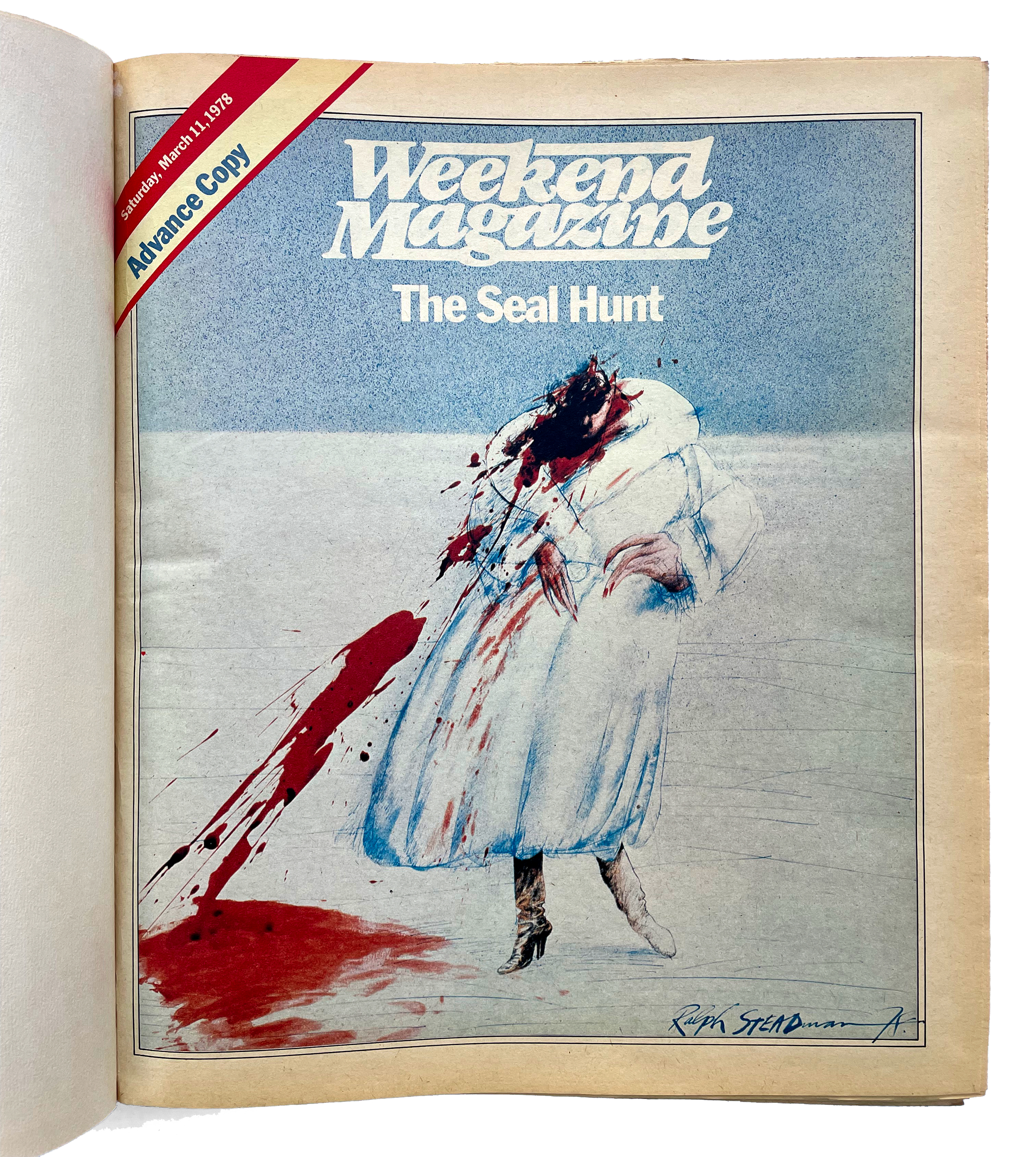
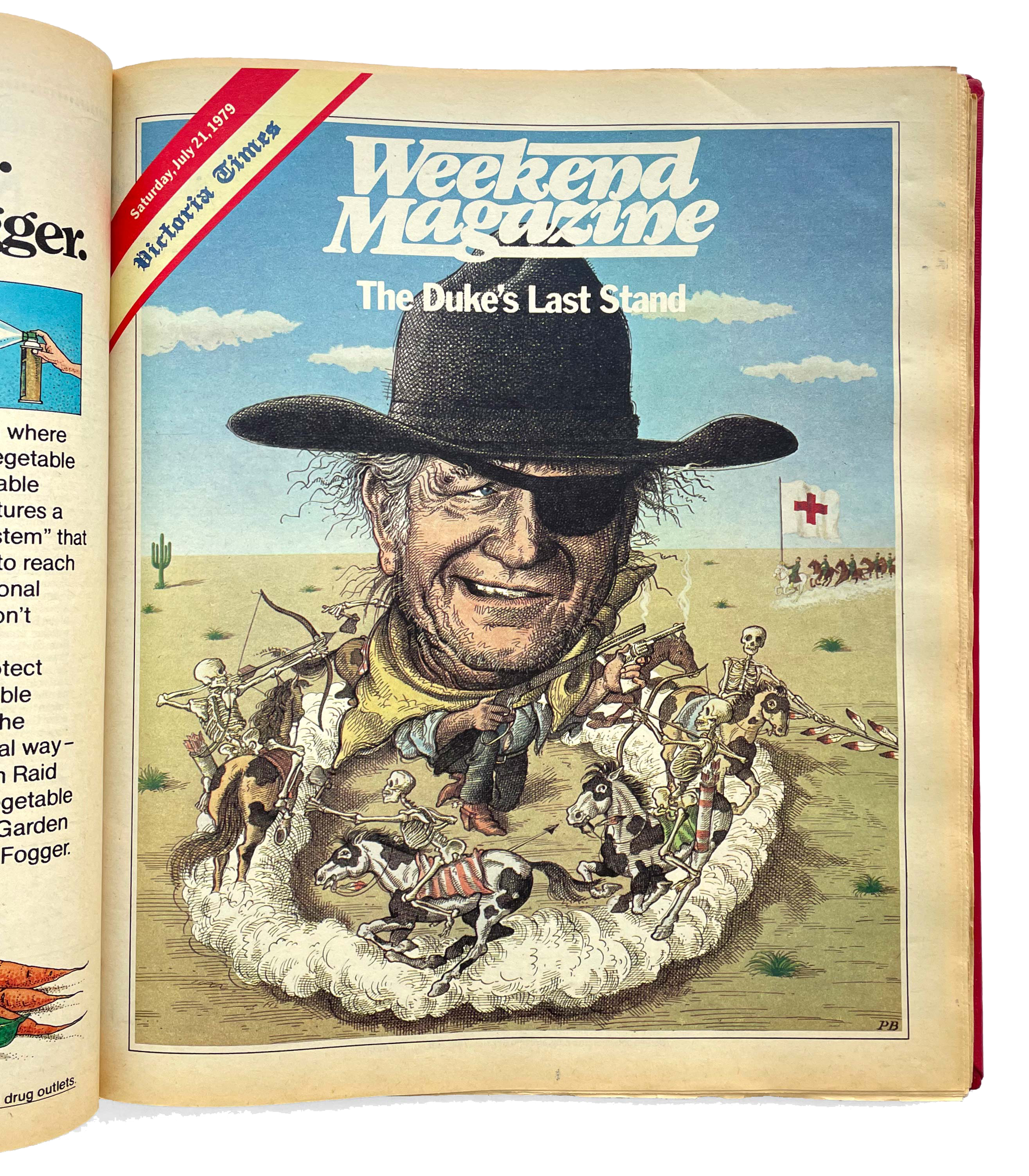
We did this cover for Weekend Magazine, the first one I think, and it was Ralph Steadman illustrating a story about seal hunting. And he had done this very terrifying illustration of a woman on ice, in a white fur coat made of seal, covered in blood. And Canadians weren’t exactly ready for that. You probably wouldn’t remember it, but it was in your lifetime, Deb, if you hadn’t left by then.
Debra Bishop: Well, I remember Weekend Magazine. I don’t know if I remember specifically that cover, but I can imagine.
Robert Priest: Well it seemed to upset most of Canada, but, that’s okay.
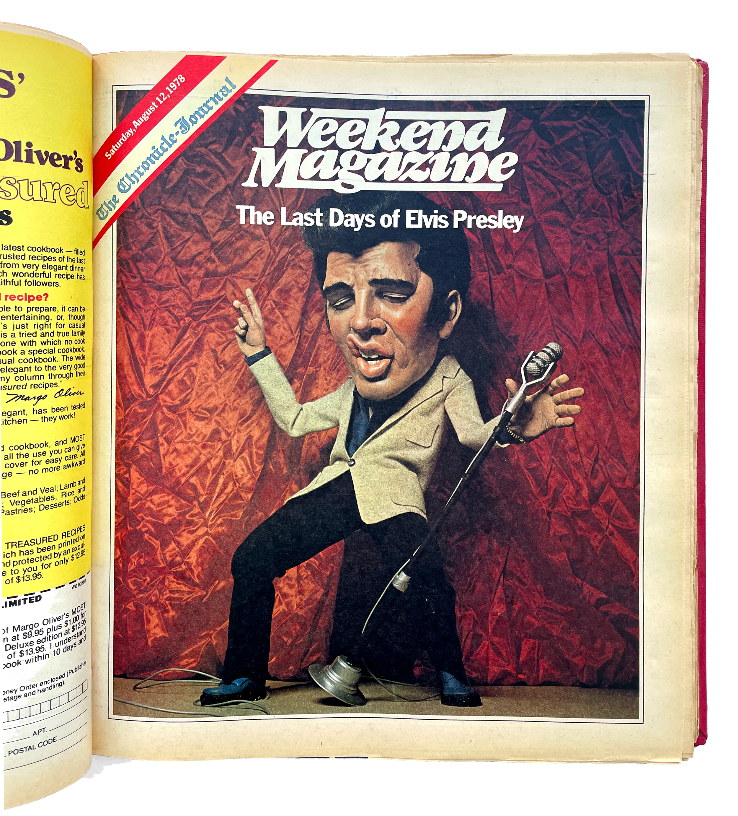
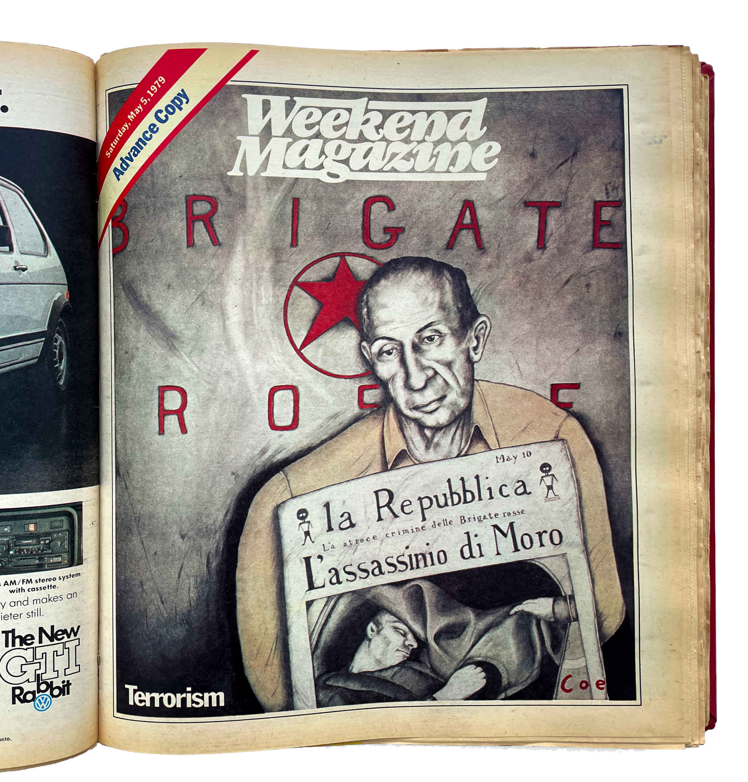
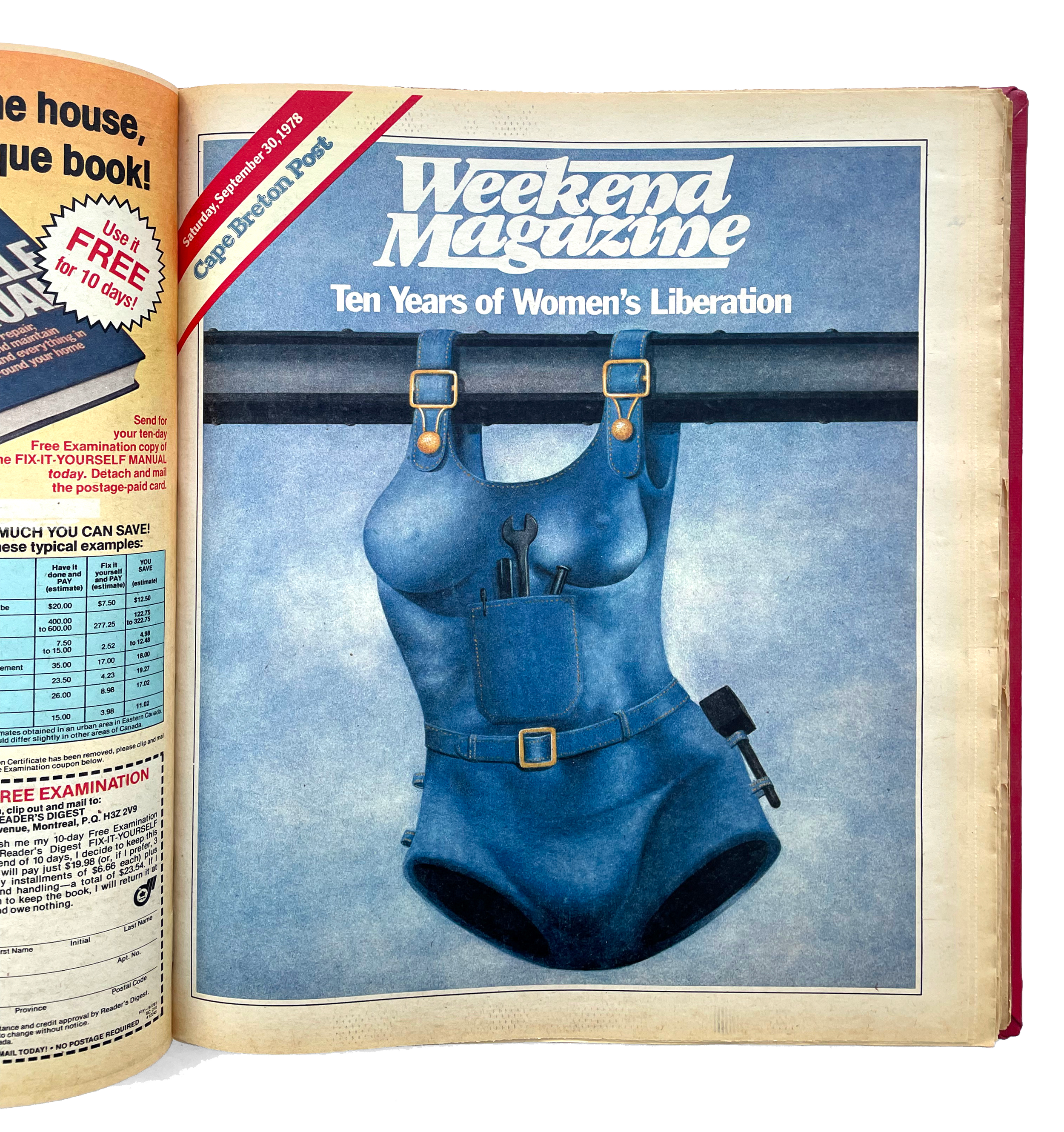
Debra Bishop: Well I remember Weekend, and I think that the covers and the design really stood out in those days. I don’t think there was anything quite as good in Canadian publishing. The covers were simple and beautiful—and ahead of their time. Was there a brief that you got from the editors at the time or were there influences?
Robert Priest: There were definitely influences. I think John Macfarlane wanted the magazine to be a little bit more conservative than I made it. And that’s one of the reasons I hired Derek, because he’s a kind of a beautiful, a “quieter” designer. But I wanted to push it on.
Roger Black was doing some pretty fantastic stuff at Rolling Stone then, and really displaying type beautifully. And I wanted to—not copy him at all—but just sort of try and do my version of that. Try to make typography front and center as well as the art. So it’s a sort of double-whammy. And assigning unbelievable illustrators from all over the world, which also pissed off the Canadians.
But John Macfarlane’s point was—and he was delighted—that if a young Canadian illustrator is a few pages away from Milton Glaser, or Jim McMullen, or Seymour Chwast, that’s very exciting and inspirational for the young Canadians. And we never worked with Anita [Kunz], although I wish we had. She was a bit young then. But we worked with somebody called Blair Drawson who was amazing, totally fantastic. And, all the contributors were pretty great, I have to say.
Debra Bishop: I remember Blair Dawson. A really amazing artist and hugely influential. In the United States as well. I particularly love that italic logo. I think it still feels quite modern. Did you work on that?
Robert Priest: I did. I didn’t design it. Tom Carnase designed it. He was Herb Lubalin’s number two, basically. They had a company together. And I went to see him when I first came out to New York. And the rough he did with it, in pencil—you could publish it. It was perfect. And we didn’t even change it. We just said, “Yes!” It was so good.
Debra Bishop: I think it’s right back in style. It’s beautiful.
Robert Priest: Yeah.
Patrick Mitchell: From my research [Weekend Magazine] looks like it was a newspaper supplement.
Robert Priest: Yes. A supplement that went to 50 newspapers across Canada. In Toronto it was The Globe & Mail. In Montréal, The Montréal Standard.
Patrick Mitchell: Every week?
Robert Priest: Every week. Yeah. So I did about a hundred of them.
Patrick Mitchell: That’s an accelerated course in magazine design.
Robert Priest: It really was.
Debra Bishop: What was the magazine design community like in Toronto? Were you guys kind of an island there on your own?
Patrick Mitchell: And who were your contemporaries there?
Robert Priest: Well, you probably know Louis Fishauf, who was doing some nice work. He was sort of a competitor. And there were a couple of other supplements that I think were a bit taken aback by what we were doing. So I’m not sure how they felt about it. And we used to win quite a lot of awards at the Art Directors [Club] and National Magazine Awards, so I’m not sure that I was the world’s most popular person there. It did, I think, move things on a little bit. And that’s important.
Patrick Mitchell: Multiple people have told me you’re competitive and I can see it’s coming out right now.
Robert Priest: Yeah. I’m, yeah. I’m especially competitive at sports, I have to say. But you know, you want to win. And if you don’t, I’m not sure that you should be doing it.
Patrick Mitchell: I think there are three of us all feeling kind of the same way. You know?
Robert Priest: Yeah. Yeah.
Patrick Mitchell: Peer recognition is a powerful thing.
Robert Priest: It is. Stroking the ego!
Debra Bishop: Was it always in the back of your mind, though, that you might want to go to New York?
Robert Priest: No. But I was like everybody else in my circle, we were fascinated by it. It was Kojak on TV, and it was in all the movies, and it was just magical. Even at its dirtiest and grimiest, when I got there it was magical. Still is.
But you know, I’ve moved to Brooklyn now just because Manhattan is a bit too intense. In a different—much different—way from when I first went there. You know The Odeon restaurant? That had just opened and you would go in and there would be Robert De Niro and Harvey Keitel, very frequently, just having dinner together. And they were terrifying. Really muscular guys who look like they want to kill you.
Patrick Mitchell: Boy has it changed. It now seems to be a place strictly for millionaires. Or billionaires.
Robert Priest: Oh, most certainly. Yeah. Yeah.
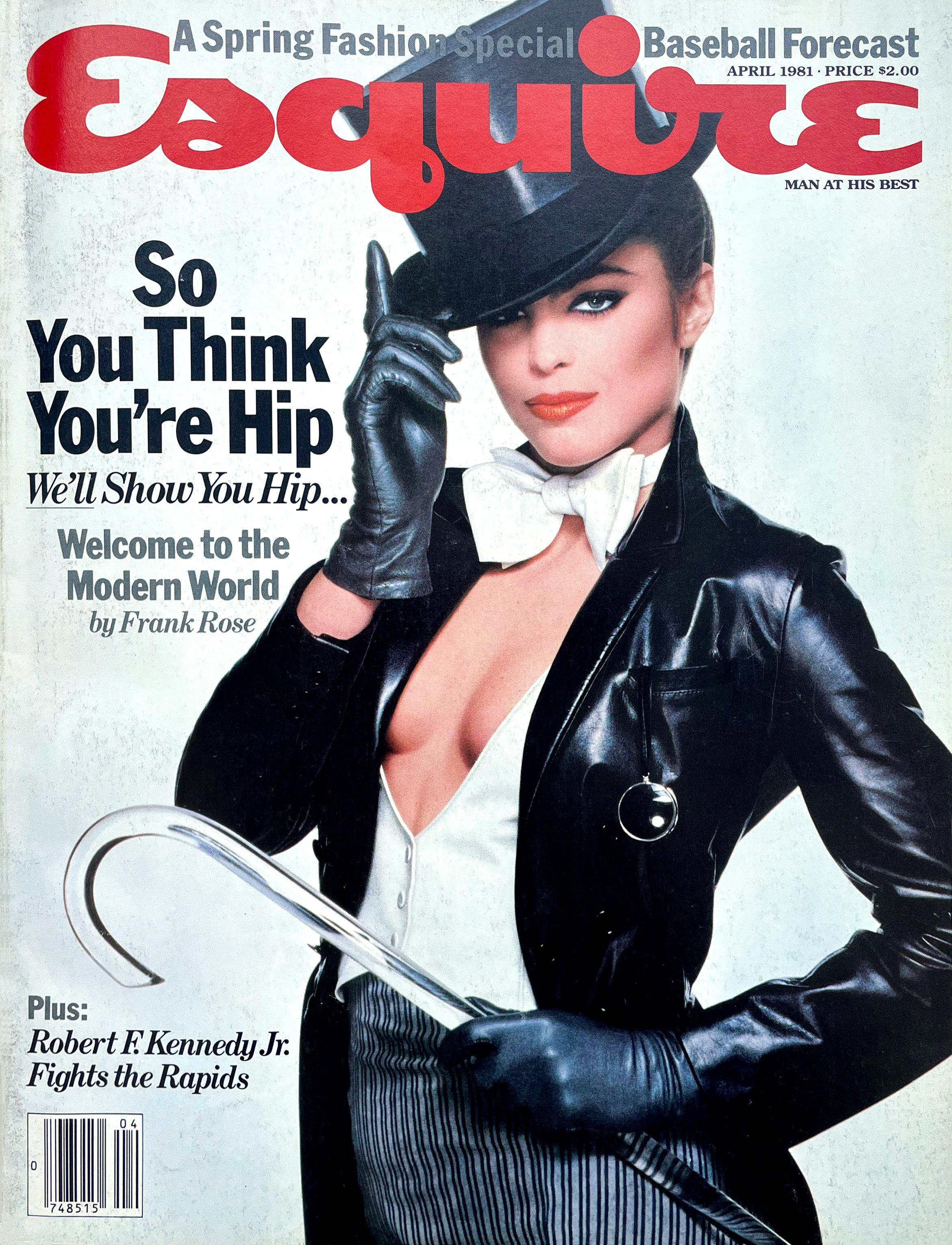
Patrick Mitchell: So moving on to Esquire, v1. This has come up many times, and it’s almost exclusively with men. It seems to me, and it’s true for me too, that every man in this business shares a passion or a desire to work at Esquire. It’s kind of the nirvana of magazines. And it seems like, obviously—you’ve worked there not once, but twice—that’s true for you, too?
Robert Priest: Yeah. Obviously it depends on who’s there editing it. But it was very glamorous. First time around it was different, though, because it had just been bought by those guys from 13-30. I think you had some association with them, didn’t you, Patrick? Phillip Moffitt and Christopher Whittle. And they were my age. So they’d just bought Esquire. And I was, what, 33 or something.
And Walter Bernard sort of orchestrated the move down for me and asked me to come and meet Phillip. And I liked him. He was really honest and straightforward. He could give a shit about the whole history of Esquire. He wanted to do a magazine for the new man that was sort of beginning to emerge, called a “yuppie.” And he did so. And he was working with some of the most amazing editors you could possibly imagine.
Our art department bullpen was right next to the editor’s area, and it was my first job and out there I’m looking at Byron Dobell and Lee Eisenberg! Fucking legends. Lee was mentoring Adam Moss at the time. He was about 10 years old. Byron Dobell was mentoring Dominique Browning, who hasn’t done too badly, either.
And they were assigning Tom Wolfe, and Gay Talese, and Gore Vidal. And Philip didn’t mind that at all. As long as he could understand it fitting into his vision. And I’ve noticed that the best editors—I’m not saying he was really the best editor, but he was very focused on what he wanted the magazine to be. And it became that.
Patrick Mitchell: You’re talking about Lee Eisenberg?
Robert Priest: Lee Eisenberg, yeah. Absolutely. Genius guy.
Patrick Mitchell: David Granger told us that he felt like Esquire under Phillip Moffitt, which was also when you were there, was maybe the best era of Esquire ever.
Robert Priest: Wow. That’s bizarre. I mean, I would say Harold Hayes or Arnold Gingrich, but okay.
“Those George Lois covers were working in England as much as they worked here—and so staggeringly different from everything else you saw.”
Patrick Mitchell: His own as well. But, in the same way that you credit George Lois at Esquire for getting you into this, you did the same for me. I first learned of Esquire and you when I started buying it when I was in college. I think you were there [at the time]. And I would say you were the reason I pursued my career in magazine design. But the ones I remember—and tell me if this was you or I know your number two, April Silver, ended up taking over at some point—but the things I remember most were the series of 50th anniversary issues that you guys did. Was that while you were there?
Robert Priest: Yeah, the first one was my last issue.
Patrick Mitchell: The big gold one?
Robert Priest: And the gold one was the one April did. April was just—again, I was talking about number twos—she was fantastic and I inherited her. I didn’t hire her. And she was just a brilliant designer, but also designed herself. She would just wear the most beautiful clothes every day. I also had Steven Doyle working for me. I inherited him too. And he is a really funny guy. Kind of insubordinate in a good way, if that’s possible. He had great ideas, shared my enthusiasm for David Byrne and Talking Heads.
So we partied a lot in each other’s apartments. But it was a very nice mood there. It just couldn’t be better to have that as my first job in New York because I was a bit isolated. I didn’t really know what to do. So the work really consumed me.
Patrick Mitchell: Well, it was also at a time—I’ve been doing a lot of research of sixties and seventies magazines—and these magazines that we remember from that era so fondly and lovingly, as you were saying earlier, the covers were one thing, but the insides were not super thought out. I’m sure for a million reasons, and limitations, and realities, but your Esquire back in the eighties really seemed, cover to cover, to be so carefully designed and thought out. And it appeared to me that April just continued the work you had been doing. So it lasted a long time. It was just really something.
Robert Priest: It did. As I said, April was really a very special person. And we had a look. And we also had a certain kind of illustration we assigned and a certain kind of photography we assigned. With the photography it was more like trying to do an album cover. Making it a bit more mysterious, less straightforward. And the illustrations were just a little, not exactly darker, but just really thoughtful. And people were illustrating fiction, which is always fun. But there were several other things.
I was also influenced by Jean-Paul Goude’s Esquire, actually. The guy who did all those Grace Jones photographs. He worked with us actually, and he made a difference. His work was just very spectacular and I think probably continues to be over in Paris. But yeah, it was a great time.
And I was so disappointed when April left the business. She was in the running for New York Woman with Betsy Carter, who was a very good friend of hers. But for some reason they took Fabien Baron, which I mean, you can understand, but it was kind of odd. I thought she was going to just walk into that and make that magazine her own and then she would have her own reputation, as it were.
Debra Bishop: It’s not often that a designer from Canada gets a huge opportunity to move to New York. Someone must have really seen the great job that you were working on at Weekend. Do you remember getting that call? What was that like?
Robert Priest: I remember talking to Walter Bernard about it and then to Phillip Moffitt about it. I had no phone call other than Walter’s, and he just said, “come down.” And what am I going to do? That was obviously, amazingly exciting and I think disappointing to have to leave such good friends. But if you’re offered at Esquire, what can you do?
Debra Bishop: What did art directors get paid in those days?
Robert Priest: Oh, that’s a really good question. I think I got $30,000 when I went to Canada, and I think when I came down it moved to about $50,000, which was pretty good then.
Debra Bishop: Interesting. So, we pretty much know what the brief was at Esquire.
Patrick Mitchell: What was the brief?
Robert Priest: They wouldn’t have hired me if they weren’t expecting some different kinds of typography. So, something unusual, something with its own identity that’s really strong but can relate to these 30-something yuppies that were emerging.
And part of it was to do with New York getting cleaned up a little bit. And I think there was sort of more ambition. We did a piece on Joe Biden actually, when I was there.
Patrick Mitchell: Well, we’re talking about the Reagan years, so that all makes sense.
Robert Priest: Yeah, that was interesting. But no, it was a very straightforward brief, actually, and we bent it as much as we could. And we were allowed to do that.
Patrick Mitchell: Were you explicitly asked to do a redesign?
Robert Priest: Oh yeah. Because it had been Clay Felker’s magazine and it was a biweekly at that point. So we took it back to being a monthly and you kind of had to do a different look because it was a more permanent, not exactly a coffee table magazine, but it was just a more permanent feel to it. Rather than the sort of, and this is not an insult, but the sort of more dispensable two-week cadence.
Patrick Mitchell: I had a nice conversation with Bob Newman the other day and he took me back to those days. And we both agreed that you were hugely influential to both of us, and I’m sure a bunch of others. But he pointed out something that seems insignificant now, but knowing how editors and designers related back then—it was very contentious, pretty much universally. He wanted to give you credit for inventing the opening spread that did not have text on it.
Well, in two ways. One, that the story began on the following spread, but also that, and other people have said this too, that prior to when you came along, people were much less respectful of illustration and photography and would slap type all over them. But you kind of created that balance of letting the art do its thing and doing something typographically on the opposite spread, which again, seems so common now, but was just kind of revolutionary at the time.
Robert Priest: I didn’t realize that that was me. But, yeah, it was something that I still have battles about. I’ve managed to persuade a lot of editors over the years that it's a good way of creating a real look rather than having to start a story on the opening spread.
I mean, I think Fred and you, Deb, did amazing work with that as a sort of model. So yeah, it’s absolutely what I wanted to do and wherever I go or whatever magazine I design I’m always encouraging that. Doesn’t always work, but I would say I’ve got an 80% record on that one.
Patrick Mitchell: Made it much easier for the rest of us.
Robert Priest: Well, good of you to say.
Debra Bishop: As I recall, you have a great skill for recognizing talent, in designers obviously, but also in illustrators and photographers. Do you have a formula for making good commissions? How do you get inspired?
Robert Priest: That’s a really good question, Deb. Mostly I like to give as much freedom as I can. There’s been a movement over the last 15 years of basically illustrators being told via the editor, but not by the editor that, “this is what we want the illustration to look like.” And that’s really disappointing for me.
I think the art directors have to sort of stick up for themselves and say, “Well, no, we can come up with a better idea than that.” Or, “This illustrator can come up with a better idea than that.” And, the compromise, early compromise was, “Okay. Let’s do the editor’s idea, and then let’s do another sketch that is our idea.” And inevitably we were able to persuade the editors to go with our idea once they saw it.
So yeah, I mean, that’s not across the board. But there’s a lot of illustration that is dire because of that sort of dictatorship that can be prevalent in American magazines sometimes.
Debra Bishop: I agree.
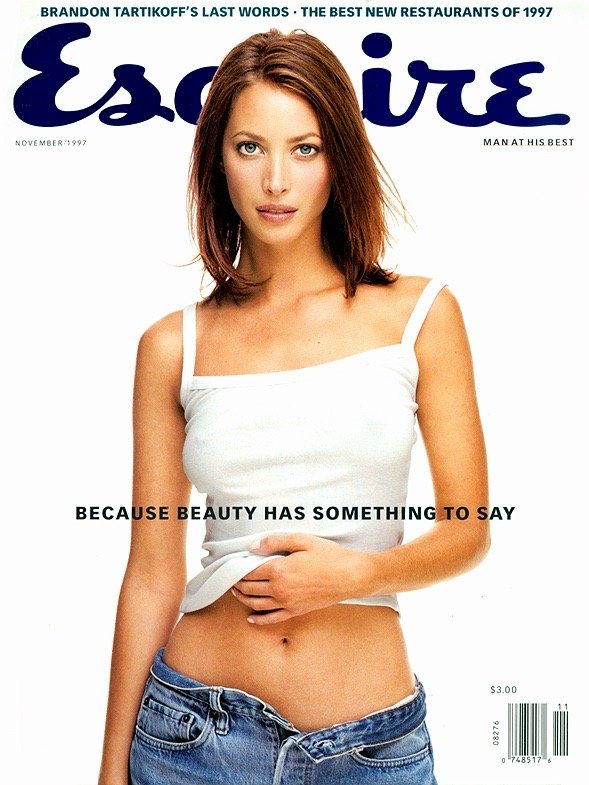
Patrick Mitchell: You designed Esquire under three different logos. I was looking at the Esquire cover archive. The one you inherited in 1979 was a real dog.
Robert Priest: It was.
Patrick Mitchell: Who do we have to blame for that?
Robert Priest: I’m not even sure I know. And I wouldn’t tell you if I did. But it was awful.
Patrick Mitchell: Well, that was Clay Felker’s Esquire. But the new/retro logo, which appeared in 1993 was kind of groundbreaking in that not a lot of magazines were looking back, as Esquire did. But I will say the logo that you created, that first sort of script logo after the Felker—boy do I like that. I really want it to come back. Can you talk about how that was created and who you worked with?
Robert Priest: Well, we worked with Tom Carnase again because, as Deb said, the Weekend Magazine logo was so beautiful. And so he did it. And it was just a little twist on the classic, but enough of a twist to have its own personality.
And again, drawn in pencil. You just couldn't believe that’s possible with Tom Carnase’s work. And it was such an honor to work with him—one of the great typographers along with Herb Lubalin, his partner. Who gets to do that?!
Patrick Mitchell: And what was the response when it appeared?
Robert Priest: Everybody loved it because, although it was memorable from previous times, it was new. It’s still fairly fresh. And everybody’s tweaked it a little bit, during the last 30 years, or whatever it is. And that’s how it is. Everybody wants to have their own tweak. Fair enough. But I do like that one too.
Patrick Mitchell: What was Esky’s status in your first period of Esquire?
Robert Priest: He was banned, essentially. He was too old school for our yuppies.
Patrick Mitchell: Well, a byproduct of your arrival in New York was the creation—along with Edward Booth-Clibborn, and Julian Allen, and Marshall Arisman, and Steve Heller—of American Illustration. Can you tell us how that came to be and how it became the steamroller that it ended up being?
Robert Priest: Well, I was very good friends with Julian Allen. He had been brought over by Milton Glaser to do those illustrations for New York magazine—of situations, often on Watergate, where [things were happening] behind closed doors and never photographed. And he recreated those moments very effectively for Milton and New York magazine.
And we just became good friends. We used to go see The Clash all the time, at CBGB and the Mudd Club and things like that. And my friendship with Julian led to us talking to Edward Booth-Clibborn, who we knew from London, who ran D&AD, the Designers and Art Directors Association and European illustration from London, and asked him to come over.
And we suggested, “Let’s do an American illustration version of that European illustration.” And we got together with Marshall, and Steve Heller, and Sue Coe, actually. And we put it together. And the really sad thing is that I’ve been to nearly every party that they’ve thrown since 1982.
There’s a passionate leader, Mark Heflin, [who] I think we all know. And he’s a wonderful guy. Has kept it going and developed it. And, I just really think he’s moved it on beautifully. It’s such a joy when I look at illustrator’s sites and see them highlighting their work that got into American illustration. It was just, it just feels really good.
Debra Bishop: Your work at Esquire led to several other high profile positions at Newsweek, US Magazine, GQ, House & Garden, and even a second tour at Esquire. We worked together on the relaunch of House & Garden. Can you talk about that? It was kind of a big deal at the time. House & Garden was coming back from the dead.
Robert Priest: It was. And I think it was a time that James Truman had taken over from Alexander Liberman. The best thing about it for me, apart from just having the pleasure of working with you every day, was the incubation period at the beginning where we just talked about it—we did this at Portfolio, too later—but the idea of having a year to just think about what a magazine should be.
And there was an all star cast. Dominique Browning was the editor, who I’d worked with at Esquire. Suzy Slesin was the number two, from The New York Times, and Lora Zarubin was the food editor, who was brilliant. David Carey was the publisher. It was a pretty talented bunch.
And, as I said, the idea of having that amount of time to think it through and think out how the photography should look and how the magazine should look—I’m not sure whether you were part of that, Deb, that incubation period. I had trouble getting you away from Fred.
Debra Bishop: Yeah. I remember it being a very long time, but I probably wasn’t part of the very early part. I remember going to Dominique Browning’s place in Rhode Island.
Robert Priest: Oh yeah, that was part of it.
Debra Bishop: That was it? That was the incubation? Oh, okay.
Robert Priest: Yeah, that was part of it. And I slept in a hotel or a house with a ghost in it. I’ve never seen a ghost before. So that was, that’s something from the past. I’ve forgotten about that.
But Dominique, she just had great, wonderful taste. And that’s what drew me toward her. Even though, at the end of the day, she did let me go. And I was stunned because I really thought Dominique liked working with me, as I did with her. And that hurt a lot.
And it was either Si [Newhouse] or James Truman who might’ve suggested it. I’ve never been able to believe that she did that, because we got on so well. But I’ll never know. And I think, as you said, Deb, on one of the podcasts that you guys have done, a lot of us get fired. And I was fired twice. “Invited to leave” is even better.
Debra Bishop: Very common in magazine publishing.
Robert Priest: It is. If you play the game at that level, at a major magazine, and you’re the art director, it’s like being a manager of a sports team. You’re not going to last. You’re going to be fired. So you have to enjoy every moment knowing that could, or would, happen. And I’ve tried to do that. But it’s always very damaging when it actually does happen.
Debra Bishop: I’m pretty shocked and amazed at how much time they actually gave us to redesign House & Garden. I’m not actually sure it was a great thing. How do you feel about that?
Robert Priest: Well, it was a great thing for me because I was able to work under no pressure with people who are extremely talented. So what’s the downside? They’re paying you the same amount and you’re expected to come up with something special. And in a way we did. Certainly that first cover, that gold first cover that Ilan Rubin shot, with Jeffrey Miller styling. It was really wonderful.
And it’s all sales with Condé Nast, of course. So they started off with a bang and if there’s any drop at all everything starts getting questioned. It’s hard to continue at that level, for sure. And you’re doing interiors. And if you don’t get that right, it’s tricky. But I felt like the sales dominated everything, obviously.

Patrick Mitchell: The amount of time you’re saying you had to create this really showed in the work. For years I carried your issues of House & Garden with me, in the slew of magazines that followed me from place to place. And at some point I decided, “I just can’t do this anymore.” So I started scanning some things. But even that was difficult because your design was so detailed that you even designed the gutters.
Robert Priest: We did design the gutter.
Debra Bishop: Yeah. I remember that.
Patrick Mitchell: It’s not easy to tear those pages out and preserve the gutters.
Debra Bishop: We realized that designing the gutters was a bad idea. Remember that Robert?
Robert Priest: Yeah, we did.
Patrick Mitchell: That’s probably what got you fired.
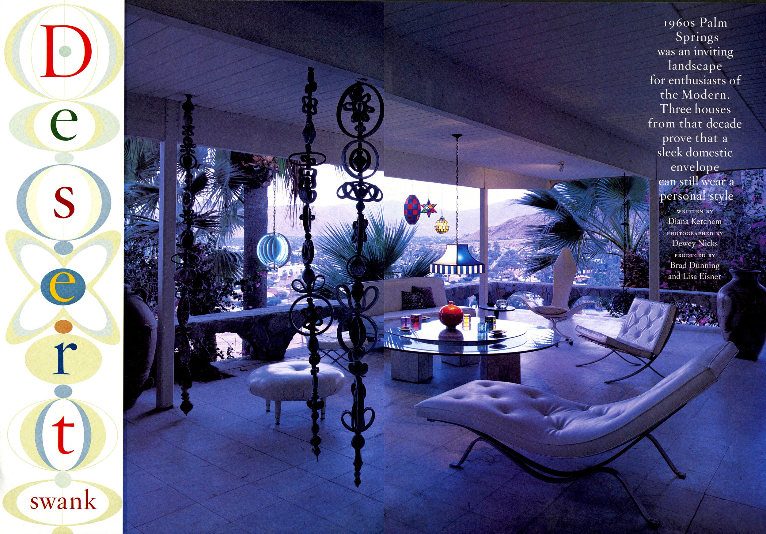
Robert Priest: Maybe actually. Well, one last thing on that. Check out Deb’s layout of a house in California that Dewey Nicks shot. It was the best layout that was ever done in House & Garden. It’s spectacular.
Patrick Mitchell: Speaking of bad endings, in our Episode 24, Steve Heller and Bob Ciano were joking about the way art directors and editors got fired. They said it was a “sport” back in the seventies, eighties, and nineties. Bob told a story of getting fired, a new editor getting hired, him getting rehired, and then him getting fired, and then the new editor getting fired. It was a whole sequence of things, but what was your worst—we’ve all been fired—what was your worst getting fired experience?
Robert Priest: I would say not Dominique and just because, I don’t know, I just couldn’t—I’ve never been able to accept it. But the only other time I was fired was when, at the end of Esquire, v2, as it were, Granger basically wanted a magazine that had never been seen before. And this happened in about June and we’d just won five gold awards at SPD and it was me and Rockwell Harwood and some other good designers.
But it was pretty unusual looking. And he wanted to take it in a different direction—which everybody says—but I think he wanted a magazine that’s never been seen before. And as far as I’m concerned it wasn’t so much different when John Korpics was doing it and when David Curcurito was doing it.
They did instigate that type-heavy, hand-drawn, tons-of-type on the cover that probably hasn’t been seen before. So if that’s what he meant, fine. But I was thinking it would be more to do with the whole thing, the holistic, Esquire rather than just the covers.
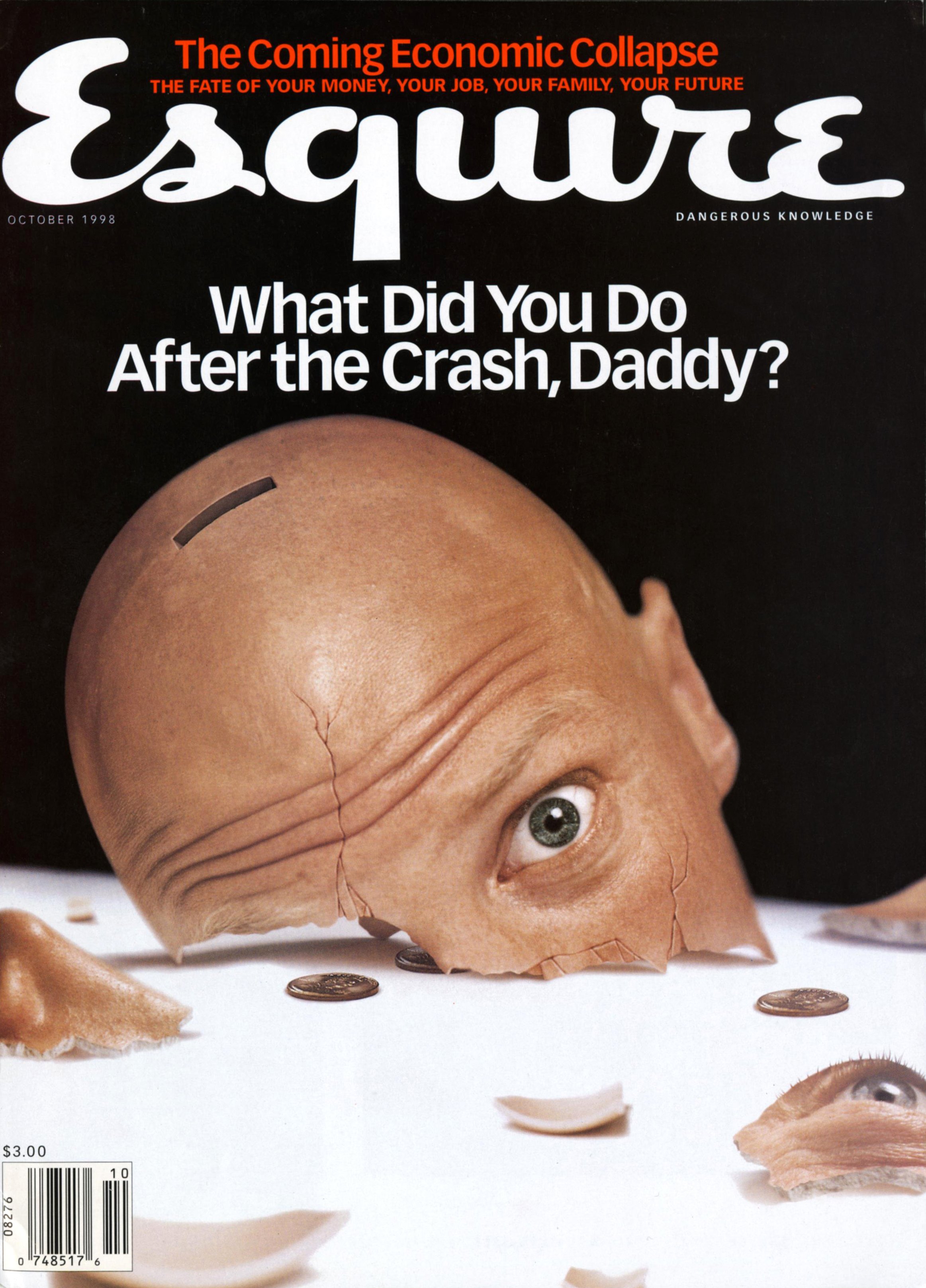
Patrick Mitchell: Everyone knows about the excesses at Condé Nast. I was talking to Karen Frank, and she talked about working at Condé, both before and after the crash, and I think you’ve done that too, and she was just so shocked that very little seemed to have changed since the crash. She said there was still a crush of town cars lined up at the entrance.
Robert Priest: Oh, really? Wow.
Patrick Mitchell: You’ve worked at all the big publishers. Can you talk a little bit about what it was like for you—the differences between Time, Hearst, Meredith, and Condé? And how that affected the way you worked at each place?
Robert Priest: Well, it was the most fun at Condé, I have to tell you. Because they spent the most money on the most ridiculous things. Like the fashion assistants taking limos—there was a car company that everybody used at all magazines, and they had the excuse of returning clothes, so that’s fine. But, yeah, money was just flowing when I first got there in 1988.
For a couple of years there were some big goings on. Everybody was spending a ton of money on expenses and all of that stuff. There was one art director, who I will not name, who had dinner at The Odeon every night—and claimed it. Which is pretty good.
To me it was never the same at Hearst. It wasn’t that they didn’t throw money around, but it just was that it could never be that time again. It was really a moment.
Steve Florio, the publisher, was there. Mad Dog, another publisher, I’m forgetting his name [Ed: Richard Beckman]. The publishers were almost as big of stars as the editor. And they were flashy. And they were good, actually. And the magazines were thick there.
And then the crash happened. It happened when I was at Portfolio and, ridiculously, we didn’t really predict it. It just happened while we were doing an issue.
Patrick Mitchell: While you were out to dinner.
Robert Priest: Yeah. While I was out to dinner. But that was shocking. It was shocking because it really signaled the end of magazines. Or the beginning of the end of very highly-paid photographers getting $10,000 for a cover. Gone. One day you’re earning $10,000, next day you’re earning nothing.
Patrick Mitchell: You were at GQ when we launched Fast Company—I was talking to Karen about this—and I remember we were trying to figure out, “What do you spend on a monthly newsstand magazine?” And I did some research on what GQ was paying, and I asked Karen, “Is this true that what I believe we found out was that the monthly art budget for GQ was somewhere between $300k and unlimited?”
And she said, “Yeah. That sounds about right.”
Robert Priest: Well, yeah. I mean, it could be right. I didn’t know that.
Patrick Mitchell: She said, “We literally assigned every piece of art from cover to cover.”
Robert Priest: Yeah. There wasn’t really a budget. And what a privilege to be in that position. It was fabulous.
Debra Bishop: Speaking of extravagance, what was the best perk that you ever got, Robert?
Robert Priest: The most dramatic perk—that actually I came to think was embarrassing—was to have a driver pick you up in the morning and take you home. I think that was at GQ. And whilst it was just wonderful on one hand, I sort of lost touch. I was never on the subway. I lost touch with humanity. And it just ended up being embarrassing coming out, and you’re getting into a car and your pals are going down the subway. It was just ridiculous. So I think that was both the best and the worst.
Debra Bishop: Patrick asked me what my perk was and I said the same thing. I didn’t say that I lost touch with humanity. If I lost touch with humanity, it was because I was getting car service home at like midnight, between midnight and three o’clock in the morning because I was working.
Robert Priest: Where were you living then?
Debra Bishop: I lived in Hoboken, so I was just across the river. But I was working at Rolling Stone. We used to have very late hours there.
Robert Priest: Yeah, it showed. Really nice work.
Debra Bishop: Of all the magazines, other than Eight by Eight, which was most fun to work on?
Robert Priest: Well, Weekend Magazine in Toronto, actually. The staff was incredibly supportive of what Derek and I were doing. The conditions were fabulous. They did give me a perk: They leased me a TransAm—a white TransAm, without the eagle on the front—because I didn’t want to be flashy. But I did want to go really fast. And that was most spectacular.
Debra Bishop: And where did you drive it?
Robert Priest: Well, I was caught speeding in the airport. I mean, you just had to touch the pedal and you’re going 60, 70, 80 miles an hour. So, I was a bit careful. Not always that careful, but I’d learned a big lesson about cars at that point.
Patrick Mitchell: Everybody has their Art Cooper stories. We’ve gotten them in previous episodes, and I heard that was a difficult relationship for you. Do you have an Art Cooper story?
Robert Priest: I have an Art Cooper memory of the three-martini-and-a-bottle-of-wine lunches at the Four Seasons. When I say frequently, I mean very frequently. And it really upset the afternoon work because, he, and if there were any GQ companions with him, are kind of different people.
Patrick Mitchell: And you had to partake?
Robert Priest: Yeah. Yeah. I went with him to the Four Seasons a couple of times, but it was nothing like a regular gig for him. I didn’t want to drink at lunchtime. And he did. I mean, he did have his assistant bring him a tumbler of vodka at five o’clock every night, and he was pretty happy at the time and he was much easier to deal with. But we all thought it was just a bit too much.
Patrick Mitchell: And it didn’t feel like a partnership to you?
Robert Priest: No. He wanted GQ to look like Vanity Fair. Like Graydon’s Vanity Fair. And they already did that. David Harris did it beautifully. I don’t know that Art was jealous of Graydon, but he certainly was influenced by Graydon’s life and his charisma. And it was clear that he wanted me to do, kind of, a more reserved look. But honestly, I don’t think I did my greatest work at GQ. It was just too complicated.
“We were always under fire from media critics. Gawker used to really trash us, almost on a daily basis. And Keith Kelly too. It was battering.”
Patrick Mitchell: We can’t finish this section without talking about Portfolio, but sort of as a precursor to that, John Korpics was telling me about the Fortune “bakeoff” that you both participated in.
Robert Priest: Oh, jesus. Yeah.
Patrick Mitchell: And he ended up getting the job, but he told me that he saw your presentation and his reaction was, “I’m toast.” Because it was so good, obviously. And I wonder, was your Fortune—I never saw it—but was your Fortune pitch sort of a preview of the Portfolio design?
Robert Priest: No, I don’t think so. If you’re talking about the Fortune pitch I did, we sort of had a dance. We thought we did a nice job on that. I’m kind of pissed off that John got it, but he’s a really good designer, so why not?
Patrick Mitchell: He also told me, and he’s told me this before, that he thinks Portfolio was one of the most perfect magazines ever.
Robert Priest: Wow. That’s really good to hear because I never—it’s very hard to know if John likes you or your work. And that’s because I basically only ran into him at SPD [events]. And SPD award shows are sort of so tinged with tension. The desire to get up there on the stage or at least pick up a medal. And I think emotions can take over, as they did with me just as much as anybody else.
Patrick Mitchell: So, as you were saying at House & Garden, Portfolio was kind of an all-star team. It seemed to be the launch that had everything behind it.
Robert Priest: It had a lot of money behind it. Yeah. We did an incubation period there, and there were just maybe six of us. It was Joanne Lipman, the editor, and Jim Impoco, who was the assigning editor. Blaise Zerega was the managing editor. And then a photo department of Lisa Berman and Sarah Czeladnicki, and Grace and I. So that was about eight people.
Patrick Mitchell: And it was the biggest launch, at that point, that we’d seen in quite a while—and maybe have seen since.
Robert Priest: Probably ever.
Patrick Mitchell: Can you talk a little bit about the lifetime of Portfolio?
Robert Priest: Well, the first part of it, the incubation period, was where this small group that I mentioned had been hired to talk about what it should be, and what it should stand for, and what it should look like, and what it should be called. We actually designed 300 logos for different names that people had suggested. That’s a lot.
And then once we decided on Portfolio, we designed a number of other typographic interpretations of the logo. So, apart from designing sections for the front and some features and everything, that was the sort of first era within. And then there was the era of dealing with Si and Tom Wallace.
So it was me, Joanne Lipman, and Si, and Tom Wallace in a room, again talking about what it should be. But based on reality. Based on what we’ve been producing. Not only in design, but the words. And I have to say, Si, who can be brutally frank, he really gave Joanne respect and space. But we were always seemingly under fire from media critics. Gawker used to really trash us, almost on a daily basis. And Keith Kelly too. It was battering.
And it was mostly reserved for Joanne, because people had decided Joanne wasn’t quite right for the job. And if she wasn’t, it was just because she was a newspaper person, not a magazine editor. And there’s quite a different skill set required to be a magazine editor from a newspaper editor. And I think that’s what tripped everybody over.
Patrick Mitchell: It lasted what, not quite two years?
Robert Priest: Yeah, about two years. But it was three for me because of the year’s incubation. Which, again, I can’t emphasize enough—if anybody ever gets the chance to do that, do it.
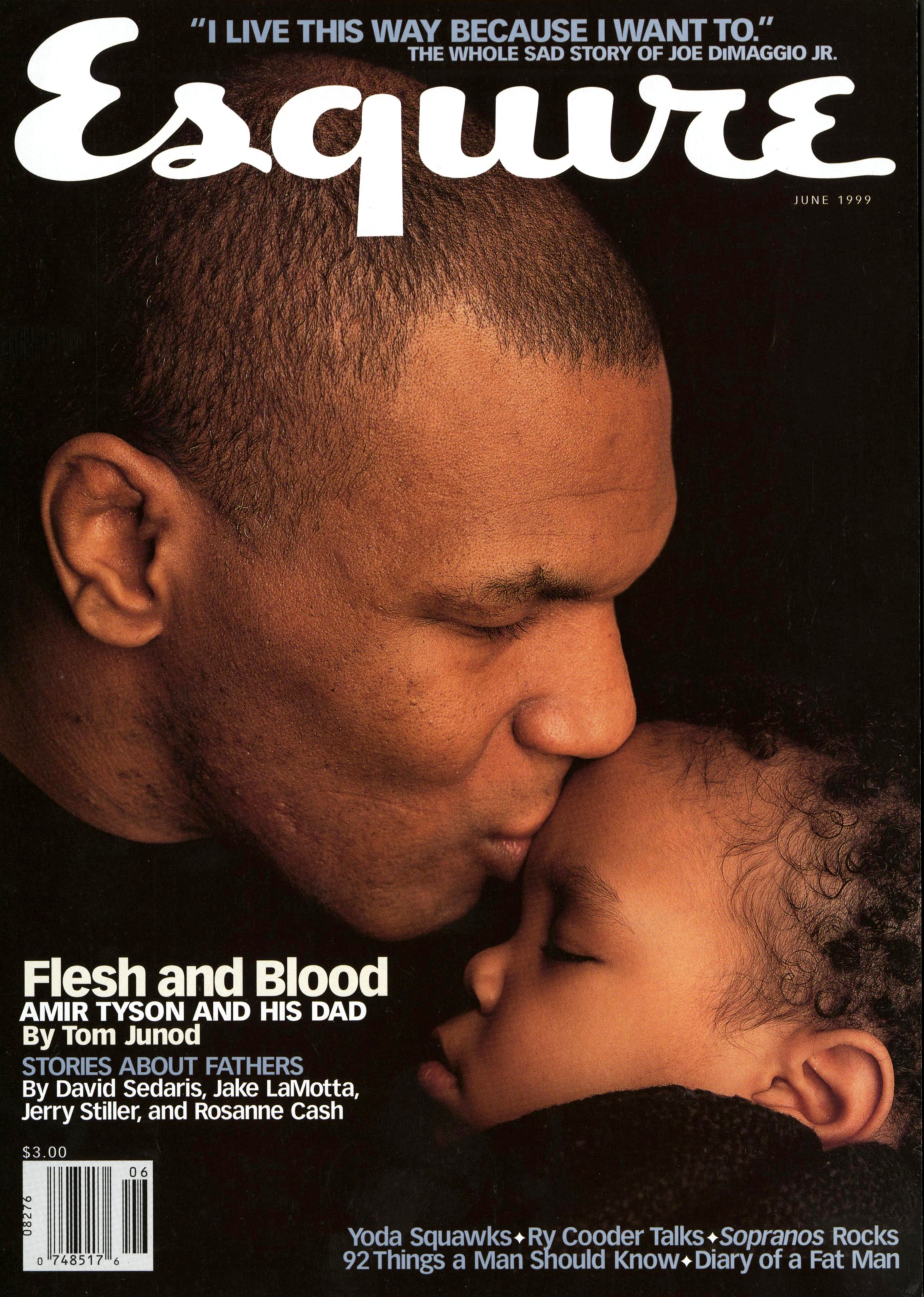
Patrick Mitchell: All right. We’re not going super chronologically here, but I do want to briefly touch on Esquire, v2. So there was a 15 year gap. Fifteen years after leaving Esquire, you go back, which is just incredibly rare. It’s like marrying the same woman twice. What were the circumstances that brought you back?
Robert Priest: Well, I guess the circumstance was that I was fired by Dominique Browning. And the person who took my job, Diana LaGuardia, was the art director of Esquire at the time. So we swapped jobs, which was as simple as that.
And again, this was Ed Kosner, who hired me, who was a long time New York magazine and Newsweek editor. And I got there and basically you could feel it wasn’t right. You could feel that he was going to be let go and then they hired David Granger. And things went pretty well for a while.
I was pretty excited about what we were doing. When I first started, Rockwell—it was incredibly funny—he used to come in every morning and say, “I can’t do this. I’m just not good enough. I’m going to resign, I’m resigning. Goodbye.” And honestly, every day, for the first month I was there, he’d do that. And of course he was brilliant.
And thanks to him we did very well. Really thanks to him because he has such an unusual point of view. And I was never quite comfortable with Granger. Although we worked together at GQ very well. And it’s just one of those things, it just didn’t work out.
But there was no decision made about, “Oh, should I, I or should I not go back.” It was Esquire. And there’s always an opportunity there to do something special. And not everybody makes it special, but it certainly the opportunity is there for the taking.

Debra Bishop: Tell us about starting Priest Media, which you started in 1999, and then again as Priest & Grace 10 years later.
Robert Priest: Well, Priest Media was a reaction to not having a job, and I decided I would start my own business. It was risky, I thought. But we had a very nice—I rented a very nice space in Tribeca and had custom furniture made for it. The whole thing.
And I took Peter Curry from InStyle Specials where I think I was before that. And Peter Curry is a good designer, for sure. And such a supportive man. He’s now the design director of The Hollywood Reporter. And then Chris Martinez, who is a wonderful designer who soon left to go to Barney’s, but he made an incredible difference. He designed my website.
But pretty soon afterwards, 9/11 happened. I was going to work, reached my office at 285 West Broadway, and saw the first plane fly by into the building. I’m not sure that I ever recovered from that.
Interestingly one of our clients—I’m not going to say who, and I’m not going to say who the person was—but he actually asked me to present that afternoon. We’d done a redesign for a magazine and they wanted to see it that afternoon, which just blew my mind. It was a struggle to get work in the beginning for sure, but we certainly tried very hard.
It was really just me finding the work. Or the phone would ring, basically. But we managed to kind of get going a little bit—after a little struggle to begin with—doing sort of more fun magazines. There was a magazine called Hollywood Life that a friend of ours knew the editor of, and we managed to get that looking quite nice and a few other things.
It was just a tricky period, honestly. I mean, I feel like everything at Priest Media revolved around 9/11. But I did a lot of sort of business magazines for smaller companies, which is a way to make money. That still seems to be part of our workload at Priest & Grace.
Priest & Grace was a completely different proposition, because for the first time I had a partner. And I couldn’t believe what a relief that was. So you can share the responsibility. On your own it’s pretty tricky. No matter how well-known you might be, you’ve still got to rely on people wanting you to design. And, mostly, it was designing magazines at that point. So you just had to work the room a little bit.
But with Grace, I hired her as a designer when I was designing O at Home. And that was a Priest Media thing. And the first time I’d ever worked with Oprah. And she came in as the third designer behind Ed Levine, who’s as we know, is great. And Angela Riechers, who is a really good designer, also.
But it was just too much work. So we hired Grace. And I could see from the very beginning that she had incredible talent. And the other thing about her is that she’s so nice to be around. She’s one of those rare people have a smile on her face all the time, and it helps. It’s just, like, you go into the office and you’re feeling good about things.
And actually we’ve got every reason to because we did get, and have got, a lot of work. And so the difference being, on your own versus sharing the responsibility, essentially. And it’s a godsend. And you do it on your own, don’t you, Patrick?
Patrick Mitchell: I do.
Robert Priest: Yeah. So you know what it’s like and you’ve done extremely well under those conditions. And I didn’t feel good about it, honestly.
“If you play the game at that level, at a major magazine, and you’re the art director, it’s like being a manager of a sports team. You’re not going to last. You’re going to be fired.”
Patrick Mitchell: By the time you got to Priest & Grace, do you think you had sort of consciously or subconsciously sworn off being on staff ever again? I mean, a lot comes with that.
Robert Priest: It does. I mean, we did design Oprah’s 10th anniversary issue because I think you were there and didn’t have time to do so.
Patrick Mitchell: I was, uh, unavailable due to being fired.
Robert Priest: Oh, well, I was never sure of those circumstances. But yeah, that was horrible. Well, at the end of that, we redesigned the magazine after the 10th anniversary issue and presented it to Oprah.
It was just a classic moment at the Beverly Wilshire Hotel in LA. And going up to the 14th floor, which I’m pretty sure was occupied wholly by Oprah, and a personal assistant took us through about 10 rooms and there was Oprah at the end of it. We had really loved what we’d done, including what we thought was a brilliant new logo, a bejewelled logo.
Patrick Mitchell: And you were working with Susan Casey?
Robert Priest: Yeah. And she was great. The absolute greatest thing about her is that she was previously an art director at Outside and Sports Illustrated for Kids. So she understood how art people should be treated, or could be treated, if you wanted to get the best out of them. And she was a pleasure. She was a delight.
And Oprah just looked like, “this better be good.” Because she doesn’t want to waste a single second of her time. And she loved it. She loved the new logo. And later, Cathie Black, president of Hearst did, and Ellen Levine, and Mike Clinton. But we could never persuade the top hierarchy to change the logo. So I was really disappointed by that.
We did her first iPad app, with all those bells and whistles that used to be on that kind of platform. But it was a pleasure working with Susan, that’s for sure.
Patrick Mitchell: Well of all of the wonderful things to come out of Priest & Grace, which we’ll be happy to show on our website, maybe the coolest thing is when you put on a different hat and launched, created, founded a magazine that you edit, design, and produce all on your own, along with, I’m sure, help. But I wanted to ask you, before we get to Eight by Eight, on your timeline I noticed you had done Howler right before.
Robert Priest: Yeah.
Patrick Mitchell: And so what was your involvement with Howler, another soccer magazine?
Robert Priest: Well, we had started the company and we needed something to occupy us. And also a promotional piece for ourselves. But I really love soccer/football, and Grace and I just got together and decided that we wanted to do it. We went to England and interviewed writers for it and came back just to think it through.
But we found a person who was an intern at Condé Nast Portfolio, actually. And he had a friend and they were thinking of starting a magazine. So we combined forces, with them controlling the edit and us the visual side. And we produced two issues of Howler, which were pretty nice, but we were unhappy with the vision. I just felt I knew a lot more about football than the editors did.
Patrick Mitchell: And so the competitive Robert decided to crush them.
Robert Priest: Yeah. But the whole thing ended pretty badly. But not to be deterred, we founded Eight by Eight. And our vision for that was to create a visual energy like the one you experienced at a Premier League football match, where you have the excitement of supreme skills, the noise of the crowd, the drama, the language of the fans, which is fabulous, and the sheer spectacle of it.
And editorially we wanted to be just a little bit more political. And humorous. And other social commentary about the aspects of the game, the inequities, the corruption, the way the game has developed worldwide. But it was just really, at its core, it was a celebration of the game, the players, coaches, fans, and the history.
So, I feel like we were on the right course. It’s just very hard to do. It took us six weeks to design it, and that’s six weeks out of making profit, really. And we were doing, at most, I think four a year, but mostly three, and sometimes two. It was tricky. Very tricky.
The responsibilities were interesting, in a way, because becoming an editor, I was assigning all the writing but I was also assigning all the illustrations and photography and finding all the pickup. And Grace pretty much designed every page of the magazine. I doubt that I designed more than six features in its whole existence.
And she’s super fast. Wonderful designer, obviously. And she handled the business side. So it was a real sort of equal—still is—an equal footing. And we’re basically equal in the company and I find that’s the only acceptable way of doing it.
Debra Bishop: Eight by Eight is no longer in print. Are you still excited about doing a digital version of it?
Robert Priest: The pandemic basically killed the print version because of the cost of paper, and printing, and distribution was so high. It almost doubled. And the fact that at that point, we weren’t allowed to ship to Canada and Europe just made up our minds for us.
But, in answer to your question, I still want to break that thing that really nobody has broken: making a magazine that—the great thing about opening magazines is those spreads. And you both did those as well as anybody.
Those moments haven’t really happened digitally for me. But I still feel there’s a way of doing it. And one of the things we’ve run into is templating, you know, to do things and get them out quickly everything’s got to be on a template.
But I still think there’s a way of doing it that is yet to crystallize in terms of how to do it, but just something that doesn’t exactly replicate the old magazine style, but has the excitement, the visual excitement. Do you feel that there’s any magazines that are able to do a successful digital version?
Patrick Mitchell: The whole reason I launched this thing, was sort of to commiserate on and answer the question of, as I told Grace, that for all these decades, really the most creative people in the world were in the magazine business.
And the creation of a magazine—the skills that go into it, the types of work that go into it, may never exist again. To this point, online design is not capable of showing that kind of work. Although, shout out to our OG sponsor, ReadyMag, which I have not really played with that much, but I know you guys do.
Robert Priest: Yeah, we use it a lot.
Patrick Mitchell: They’ve made a tool that I think comes the closest to allowing people to create. I think maybe mostly typography is the thing that’s missing online.
Robert Priest: It is.
Patrick Mitchell: But they allow you to do that.
Robert Priest: But also, the format for a phone is vertical, and most people receive their information on a phone. So that’s the tricky part.
Patrick Mitchell: I want to thank you for sharing your career chronology. It was jaw dropping. I actually had to print it out because it was too long to scroll. But just looking at the volume of jobs and clients and different kinds of work, and doing the math in my head, I’m guessing you’re about 106?
Robert Priest: I am. I just turned. I had the birthday on Monday. Hundred and six years old.
Patrick Mitchell: But seriously, what is your plan moving forward? Are you the type that’s going to die while exporting a PDF for a client?
Robert Priest: Sadly I am. And that’s a horrible way of putting it. But yeah, I don’t really want to retire. I still feel quite young, actually.
Debra Bishop: Sorry, Robert, that, that was not my question.
Patrick Mitchell: Well, there’s a genuine thought behind that. And I agree. In this podcast we’ve been talking to people from every generation of magazine design. But I think it’s true for all people in our profession, I’m probably speaking for Deb, too, this work is too much fun to stop. I assume you feel the same way.
Robert Priest: Yeah I do.
Patrick Mitchell: I mean, would you rather be golfing?
Robert Priest: No, absolutely not. I would prefer to be working because that’s going to keep your mind more stimulated. But, you know, Paul McCartney is over 80. So is Mick Jagger. So why would anybody stop working?
Patrick Mitchell: Exactly.
Debra Bishop: Keep going, Robert.
Patrick Mitchell: So, our tradition at the end of our episodes is to ask the Print Is Dead Billion-Dollar Question. And that is that a very rich person, Laurene Powell Jobs, Jeff Bezos, has an offer that you can’t refuse. They want to give you a blank check with one caveat: you have to use it to create and launch a print magazine. What would you do?
Robert Priest: First of all, jokingly, but I would do Eight by Eight, 2.0, properly. But failing that—Jeff is going to like this—I would do a magazine on aerospace. A very visual one all about the science, the equipment, the sort of blind ambition, the greed. But also, beautifully designed in a completely new way. I mean, the equipment and just the look of everything in aerospace is so beautiful.
And I would employ, on contract, Spencer Lowell, Dan Winters, and Benedict Redgrove in London, to do the photography. And it would be like a coffee table book. It would be thick with information about the science and everything.
For more information, visit Robert Priest’s website, or follow him @priestandgrace on Instagram.
More Like This…